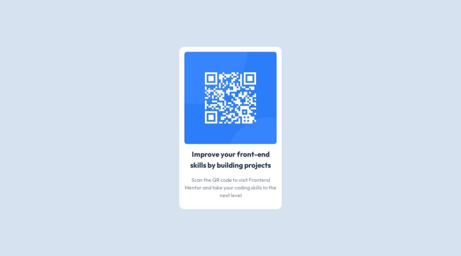
Responsive QR Code website using Flexbox and The Box Model
Design comparison
Solution retrospective
It's my first time of working with a CSS reset and using the rem unit for sizing the box model and I am proud of the clean and responsive result.
Next time I will try to use flexbox within my main element, not just using flexbox to center the main element within the body.
What challenges did you encounter, and how did you overcome them?Deciding a max-width with a value of rem was challenging, with a bit of testing out different rem values I knew which one would work out.
What specific areas of your project would you like help with?How do I decide best sizing properties and values for the width and height of my body element or wrapper, when I intend centering a div in it with flexbox.
there is width, min-width, max-width, height, min-height and max-height. it gets a bit confusing, which one works and which one doesn't?
Community feedback
Please log in to post a comment
Log in with GitHubJoin our Discord community
Join thousands of Frontend Mentor community members taking the challenges, sharing resources, helping each other, and chatting about all things front-end!
Join our Discord
