Not Found
Not Found
Not Found
Not Found
Not Found
Not Found
Not Found
Not Found
Not Found
Not Found
Not Found
Not Found
Not Found
Not Found
Not Found
Not Found
Not Found
Not Found
Not Found
Not Found

Submitted

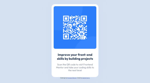
Responsive QR Code website using Bootstrap and Flex

@gabriel-iturra

Desktop design screenshot for the QR code component coding challenge

This is a solution for...

  • HTML
  • CSS
1newbie
View challenge

Design comparison


SolutionDesign

Solution retrospective


What are you most proud of, and what would you do differently next time?

I was able to actually finish the challenge, even with everyday obstacles (work, life tasks, and so on), and was able to learn and understand better what I developed.

I would try actually to develop future challenges faster. For that I would organize my time better in order to finish this, as I am aware that Frontend Developer jobs have a controlled schedule to finish projects.

What challenges did you encounter, and how did you overcome them?

The responsive aspect was difficult. Most of the times the card element would not 'shrink' properly when using different screen.

Also, getting to learn about viewport units and Flex, and try them right away, was not easy.

What specific areas of your project would you like help with?

To know any other alternative for achieving responsiveness on the task. For example, was the "clamp" CSS really necessary? Is it better to just use media queries?

This insight would be appreciated, as I am aware this can help in future projects.

Community feedback

Lemnsa 110

@Lemnsa

Posted

Congratulations @gabriel-iturra completing this project

Using both clamp() and media-queries help with achieving responsive design. They are just twins who have their own roles to play.

Which is better?

clamp() is better when:

You want a single rule that adjusts smoothly across a range of screen sizes. It's great for responsive typography or scaling elements based on viewport size(like font size, margin, padding, etc.).

example: font-size:clamp(16px, 2vw, 24px);

Which means the font size will be at least 16px, but grow as the viewport width (vw) increases, capped at 24px.

Media queries are better when:

You need to make more significant layout changes or apply different styles based on specific device characteristics (like orientation or resolution). They offer more control over how your content adapts to different devices.

example:

* CSS for screens wider than 600 pixels *
@media screen and (min-width: 600px) {
  body {
    background-color: lightblue;
  }
}

* CSS for screens narrower than 600 pixels *
@media screen and (max-width: 600px) {
  body {
    background-color: lightgreen;
  }
}

These media queries allow you to customize how elements on your webpage look based on the width of the screen.

So, you can then see that based on this information Media queries will help you reach your goals of different layouts on screens of different sizes.

Always do more research if the concept is not clear yet!

0

Please log in to post a comment

Log in with GitHub
Discord logo

Join our Discord community

Join thousands of Frontend Mentor community members taking the challenges, sharing resources, helping each other, and chatting about all things front-end!

Join our Discord