

Design comparison

Solution retrospective
i didnt really encounter any major challenge while building this project except for the fact that i still want to understand the dynamics behind responsive web design especially for mobile devices. i would also love the community to take a look at my code and correct me on the areas i didnt do well based on structuring for improvement
Community feedback
- @correlucasPosted about 2 years ago
👾Hello Anita, Congratulations on completing your first challenge!👋 Welcome to the Frontend Mentor Community!
1.The html structure can be reduced by removing unnecessary div, all you need is a single
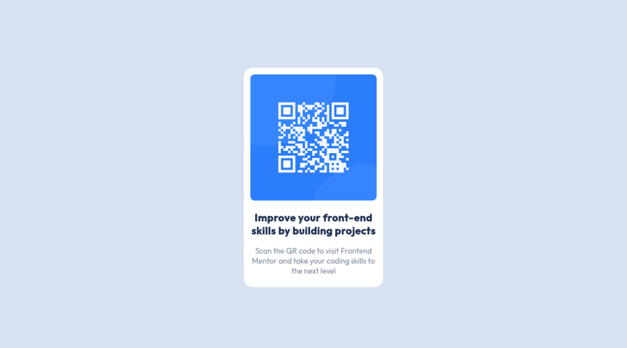
<main>or<div>to keep all the content inside, and nothing more. The ideal structure is thedivand only the image, heading and paragraph. Here’s one example to show can be cleaner this HTML structure:<body> <main> <img src="./images/image-qr-code.png" alt="Qr Code Image" > <h1>Improve your front-end skills by building projects</h1> <p>Scan the QR code to visit Frontend Mentor and take your coding skills to the next level</p> </main> </body>2.To reduce the CSS you can use the direct selector for each element instead of using
classthis way you have a code even more cleaner, for example, you can select everything using the direct selector for (img, h1, and p, main).✌️ I hope this helps you and happy coding!
Marked as helpful0 - @romila2003Posted about 2 years ago
Hi Anita,
Congratulations 🎉 for completing this challenge, the card looks great however I found some issues I want to address:
- Since this is not a responsive challenge, it does not require you using media queries. Also, your card looks great in desktop however when you decrease the screen size, the width of the card is quite large. I would suggest you to remove the media queries and use the same width in desktop for the overall width of the card e.g.
.container { max-width: 320px } - It is great that you used the right semantics for the container however it is best practice to wrap the footer within the
footertag too e.g.<footer class="attribution"></footer> - In your report, you have a HTML issue regarding your
imgtag. You should use the forward slash/instead of the backward slash\.
Overall, great attempt and wish you the best for your future projects so keep coding 👍.
Marked as helpful0 - Since this is not a responsive challenge, it does not require you using media queries. Also, your card looks great in desktop however when you decrease the screen size, the width of the card is quite large. I would suggest you to remove the media queries and use the same width in desktop for the overall width of the card e.g.


Please log in to post a comment
Log in with GitHub
Join our Discord community
Join thousands of Frontend Mentor community members taking the challenges, sharing resources, helping each other, and chatting about all things front-end!
Join our Discord