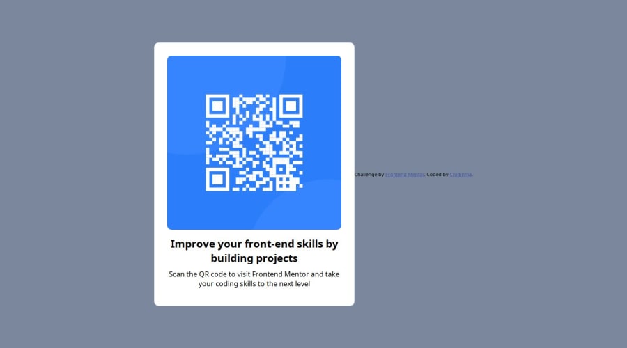
Design comparison
Solution retrospective
I encountered a lot of challenges. One of them being making the code responsive. I haven't still mastered this yet but I used "rem" instead of "px" and I also used percentages in the width of the divs and image. I also used a little bit of media queries. I found difficulty in centering my texts and images. For the texts, I used "text-align" (phew) and for the image, I majorly used "margin". I haven't still perfected the centering of items. All these I did with the CSS.
What specific areas of your project would you like help with?I would like help with media queries and centering items. "justify-content" and "align-items" didn't seem to work even after I've used the "display:flex". Help!
Community feedback
- @davimartins017Posted 4 months ago
you put a "display: flex;" in the body of the html, that's why your footer was next to the qrcode, not below. What might help is to divide it better, so you can work with each line separately and using id and class for that
Marked as helpful0 - @ChamuMutezvaPosted 4 months ago
Hi Chidinma
Congratulations for taking your first challenge, here is my opinion after going through your project
- make use of semantic elements where to improve the accessibility of your project. These are elements designed to serve a certain purpose and can be read assistive technology users. In this challenge I would expect the elements such as
main
and maybe footer as shown below
<main class="code"> <img src="./images/image-qr-code.png" alt=""> <h2>Improve your front-end skills by building projects</h2> <p>Scan the QR code to visit Frontend Mentor and take your coding skills to the next level</p> </main> <footer class="attribution"> Challenge by <a href="https://www.frontendmentor.io?ref=challenge" target="_blank">Frontend Mentor</a>. Coded by <a href="https://github.com/Chidiinma">Chidinma</a>. </footer>
The main element - provides the primary content of the site. You can read more here layout landmark elements
-
The image in this case is carrying a message , hence the alt value should be a message not an empty string
-
Format your code - the large white space between your content is not necessary
-
there is need to have a reset stylesheet , that ensures that your content is styled correctly between browser.
-
in your body style , you have
height: 100vh;
, change it tomin-height: 100vh;
, that is important as that allows content to scroll if it does not fit the screen. Still with the body, addflex-direction: column;
so that the content flows top to bottom as per design. Apply some padding as well, to allow some space on mobile devices between the body an the content
0 - make use of semantic elements where to improve the accessibility of your project. These are elements designed to serve a certain purpose and can be read assistive technology users. In this challenge I would expect the elements such as
Please log in to post a comment
Log in with GitHubJoin our Discord community
Join thousands of Frontend Mentor community members taking the challenges, sharing resources, helping each other, and chatting about all things front-end!
Join our Discord