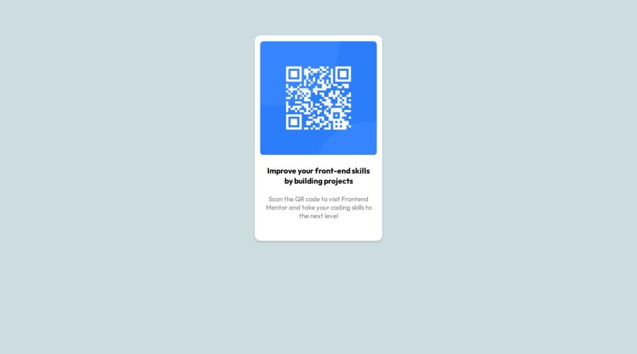
Design comparison
Solution retrospective
I'm glad I was able to finish it up faster than I thought. Next time, I would make my code cleaner with less trial and error.
What challenges did you encounter, and how did you overcome them?I couldn't get the right color at first and then I had unexpected outcomes after using flex. I adjusted the color mixer till I got it right and then I went through what I know about flexbox and implemented it step-by-step.
What specific areas of your project would you like help with?Positioning, generally, including flexbox and grid.
Community feedback
- @danielmrz-devPosted 7 months ago
Hello, @Holardev19!
Your project is looking fantastic!
I'd like to suggest a way to make it even better:
- Using
marginisn't always the most effective method for centering an element.
Here's a highly efficient approach to position an element at the center of the page both vertically and horizontally:
📌 Apply this CSS to the body (avoid using
positionormarginsin order to work correctly):body { min-height: 100vh; display: flex; justify-content: center; align-items: center; }I hope you find this helpful!
Keep up the excellent work!
0 - Using
- @FouratidaniPosted 7 months ago
Nicely done pal , just if you change the background color , the size of the text and move the main component a bit down your work will be perfect .
0
Please log in to post a comment
Log in with GitHubJoin our Discord community
Join thousands of Frontend Mentor community members taking the challenges, sharing resources, helping each other, and chatting about all things front-end!
Join our Discord
