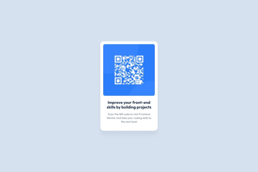
Design comparison
Solution retrospective
Hi there! I'm currently learning CSS and working on this small project to sharpen my skills. I'm not entirely confident about media queries yet, so if you have any suggestions for improvement, please feel free to provide feedback.
Community feedback
- @ThatDevDiazPosted over 1 year ago
Hey, pretty close.
The stylesheet should be using colors and fonts provided by the designer (or in this case the challenge's design sheet). If you wanted to use your own colors and fonts you absolutely could, but it's probably good practice to use what's provided.
Not sure why there's so much JS or Tailwind incorporated in here for an HTML/CSS project. Maybe the notes specified you could use it for this challenge, and I didn't catch that.
Github is showing the original readme instead of the one that should've been replaced by your notes. Small detail but might help you down the line for bigger stuff with transparency.
Your HTML seems a little cluttered. Try looking at the project as 2 sections within the "container". The QR code itself, and the description. You have multiple paragraph elements when really you only needed 1 following an H1 element. This helps a lot when you're on the CSS sheet because there's less clutter to work through.
*Side note. Try to minimize styling your HTML in the HTML itself. You have a lot of font changes within the HTML which can be confusing for larger projects.
As for the Text below the QR code, you could've aligned the text to the center using text-align and that should've had the text looking more like the original. Also experiment with max-width within text elements so that you can force text to stay in a certain paremeter. If you're using flexbox, make sure you're centering the element within the flexbox because max-width will not work on it's own. The text will be glued to the left side of the flex box if you only use max-width which is why you also have to center it horizontally using jusify-content. You'll see what I mean if you give it a try.
Overall, you got most of it down, the biggest thing I noticed was the discrepancies in the design with the QR code surrounding color and the font. This is what somebody looking from the outside in will notice right away if they didn't have access to the code.
Good stuff!
Marked as helpful1@TuanAnh45468Posted over 1 year ago@ThatDevDiaz Thank you! I've learned so much from your feedback. I appreciate the time you took to help me.
0
Please log in to post a comment
Log in with GitHubJoin our Discord community
Join thousands of Frontend Mentor community members taking the challenges, sharing resources, helping each other, and chatting about all things front-end!
Join our Discord
