Not Found
Not Found
Not Found
Not Found
Not Found
Not Found
Not Found
Not Found
Not Found
Not Found
Not Found
Not Found
Not Found
Not Found
Not Found
Not Found
Not Found
Not Found
Not Found
Not Found

Submitted

Responsive QR code using flex box

@siavashgholami

Desktop design screenshot for the QR code component coding challenge

This is a solution for...

  • HTML
  • CSS
1newbie
View challenge

Design comparison


SolutionDesign

Solution retrospective


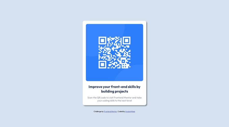
is the box shadow correct? what about the widths and heights? not working in mobile landscape and its not centered in mobile screen

Community feedback

d8701a 240

@d8701a

Posted

Hello and congrats for completing this challenge!

Now to answer your questions, you did add a box-shadow and that's completely fine, as a matter of fact your version looks more polished, and I like it. I don't think, however, that you needed to add box-shadow property at all, I believe this card doesn't have it set, but in the end, it really is a matter of preference, not a mistake. You can simply remove it or decide to keep it, both ways are fine.

When it comes to centering the image in the mobile view, it's probably due to margins and padding. I can see in your code that you used the mobile-first approach, and that's commendable. So you set a media query for screens larger than 400px where you change the width of the container, but you didn't change all the paddings and margins. Usually, when we resize the size of a container/wrapper, margins and paddings need to be adjusted as well.

Also if you want to have better control of images, make them responsive etc., you can try wrapping them inside a .div, setting dimensions on that .div and then just telling the img to take the whole width of that .div. Like this:

<div class = "image__container"> <img>your image goes here</img> </div>

And in CSS:

.div { width: 420px; height: auto;

img { width: 100%; height: auto; (if you want an image to preserve an aspect ratio) object-fit: cover}

This way you are telling the img to take 100% of its parent container, which is the .div container and it's width will be 420px. In case you decided to set the width of your image to 50%, then it would take only 50% of 420px. It makes images responsive and easier to manipulate.

Also by limiting the container size, your image for this project would've been smaller.

Other than that, I see you are already familiar and comfortable using custom properties/variables and rems as relative units which is awesome! Keep up the good work and just keep on learning!

0

Please log in to post a comment

Log in with GitHub
Discord logo

Join our Discord community

Join thousands of Frontend Mentor community members taking the challenges, sharing resources, helping each other, and chatting about all things front-end!

Join our Discord