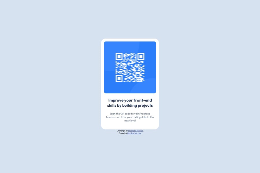
Design comparison
Solution retrospective
Ultimately I think I did pretty well at getting the size of the elements to match up with the design reference, though feel like I used too much hard-coding on the sizes for my preference.
What challenges did you encounter, and how did you overcome them?I learned about clamp. I didn't end up using it since the research rabbit hole I was falling into on that topic seemed too time-consuming and excessive for what I needed to accomplish in this case, but learning new things is always a plus.
So anyway, I just ended up using my best guestimates to adjust sizes in pixels, which gets the job done if nothing else.
What specific areas of your project would you like help with?What do you think, was using pixel measurements and hard-coding width/height a fine call here or was there a better solution that could work here? I definitely feel like designing things with responsiveness in mind is one of the trickier things for me to wrap my head around at the moment.
Updated: After updating the CSS, I've now utilized rem units and max-height/width to provide better responsiveness on especially small screen sizes, courtesy of advice from @weldu0.
Community feedback
- Account deleted
👋 Hey, @starberries! To answer your question, use
remfor most cases andpxonly when specifically required.If you’re not familiar with
remorem, try getting into these units because they are much better thanpx. To convert from px to em:- 1em is typically equivalent to 16px (assuming the default font size).
- To convert pixels to ems, divide the pixel value by 16 (px / 16 = em).
Regarding fixed width/height, there are times when you need them, but for containers like in this case, use
max-widthandmax-heightinstead.You can read more about the units here.
Very good course about responsive by Kevin Powell
Like you said, you did very well. Great work! 👏
I hope you find this helpful. 😊
Marked as helpful1@starberriesPosted 7 months agoThanks a lot for the advice, @weldu0! I actually didn't even realize
rem/emwere applicable to sizes beyond font as well, so that's immensely helpful alongside utilizingmax-height/max-width, greatly appreciated!0Account deletedYou're welcome! I'm glad to hear that it was helpful. @starberries
0
Please log in to post a comment
Log in with GitHubJoin our Discord community
Join thousands of Frontend Mentor community members taking the challenges, sharing resources, helping each other, and chatting about all things front-end!
Join our Discord
