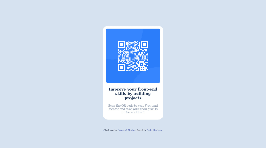
Responsive QR Code using CSS Flex
Design comparison
Solution retrospective
the difficult things while building the project is literally about positioning
Community feedback
- @amulyalovescodingPosted over 2 years ago
HelloDhemol, Congratulations on completing this challenge! I really liked the result of your project, but I have some tips that I like to share:
1- Every page should have one main landmark <main>. So replace the div that wraps the whole content with <main> to improve the accessibility. click here
2- All page content should be contained by landmarks, you can understand better by clicking here: click here
3- A
metaelement with anhttp-equivattribute whose value isX-UA-Compatiblemust have acontentattribute with the valueIE=edge. Context:UTF-8> <meta http-equiv=X-UA-Compatiblecontent=IE=7> `You can go through my solution if you like click here
✌️ I hope this helps you. Happy Coding.
Marked as helpful1@dhemolPosted over 2 years ago@amulyalovescoding Hi Amulya, this really means a lot for me. Well noted. so thankyou for this comments & tips.
1
Please log in to post a comment
Log in with GitHubJoin our Discord community
Join thousands of Frontend Mentor community members taking the challenges, sharing resources, helping each other, and chatting about all things front-end!
Join our Discord
