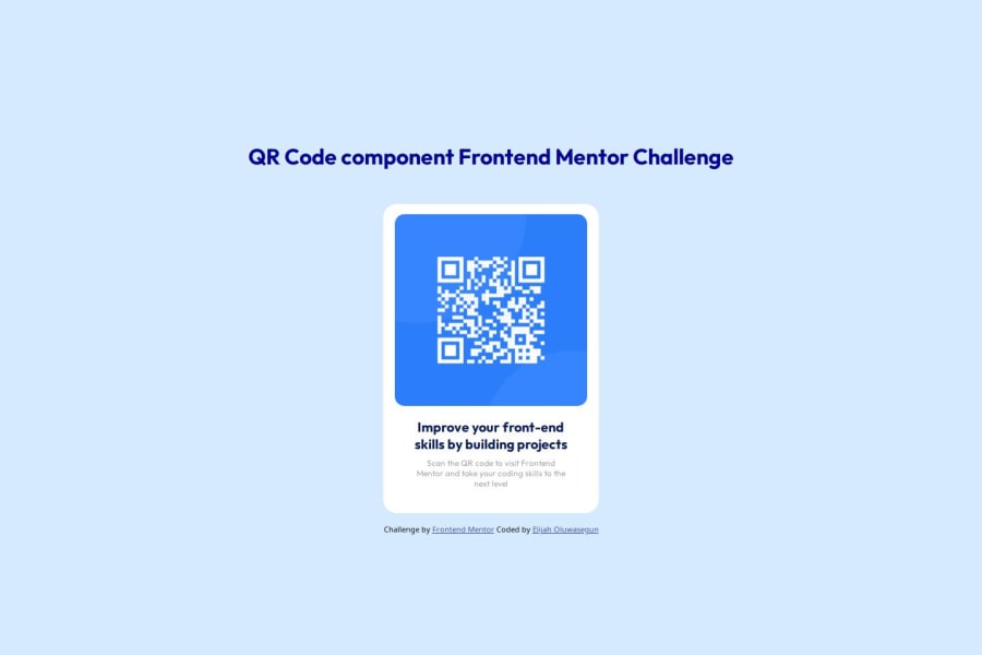
Responsive QR Code using CSS display properties
Design comparison
Solution retrospective
I would say I am most proud of not giving up on this project. Early on, my computer died while working on this project erasing all my data which made it hard to concentrate on finishing the project. I am glad that I pulled through to finish this challenge.
One of the things I would probably do differently is to be patient with myself, not being in a hurry to finish while enjoying the process.
What challenges did you encounter, and how did you overcome them?One of the challenges I encountered was finding the right resources to help me solve the challenge. I overcame this by reading various articles, resources and watching videos extensively. Additionally, I also joined communities that helped to improve my knowledge about HTML and CSS.
What specific areas of your project would you like help with?I would love help with writing a good commit message. I would also love help with CSS flexbox, specifically where the class = qr_sect. I was wondering if there is a way for the whole qr-code component to be in the center of the page both horizontally and vertically without using margin properties as I did.
Community feedback
- @ajasmine94Posted 25 days ago
Hi :)
You did a great job for being able to make this as close as the actual one
I may not be the best person when it comes to providing some help as I am also practicing my css skills :) But in the meantime, I will leave these things here and hopefully they can be helpful to you as well as it did for me.
- I see that you have implemented flexbox in your classes and I believe you might only need it on your body and outer sect classes. The rest are the children of that container and the ones we are aligning inside that container. As for your question regarding centering the qr component, i think it would help that you set the height (min-height) of your body to 100vh (viewport height) which means the whole size of your screen.
- it might help to name your classes with a more descriptive name
0 - @whiteriver-devPosted 25 days ago
Let me help you with the question regarding centering as I had the same issue. I can see that you had set up flexbox and had justified and aligned to center which is good. However, I believe you do not need the outer section div.
As to centering, the reason why it's not working as intended is because your body is not full height (you can see this when hovering over it in 'Inspect Element' on Google Chrome'. So it would only center items within the boundaries of the body which is not full size. The way I fixed this in my project was:
html, body { background-color: #D5E1EF; height: 100%; display: flex; justify-content: center; align-items: center; }
The height sets the body to the entire page. Then everything within body is centered with flex. Hope this helps.
0 - @ZugimPosted 25 days ago
Looks really good! Nice job. I'm probably not the best person to help you with writing good commit messages so I'll leave that to someone else to answer. As for centering both horizontally and vertically it can be achieved easily with both
flexbox
andgrid
.Centering horizontally and vertically
The above link should get you started.
0
Please log in to post a comment
Log in with GitHubJoin our Discord community
Join thousands of Frontend Mentor community members taking the challenges, sharing resources, helping each other, and chatting about all things front-end!
Join our Discord