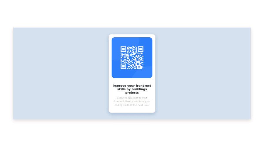
Design comparison
Solution retrospective
There is my first challenge! I hope you like it!
Community feedback
- @elaineleungPosted about 2 years ago
Hi David, welcome to Frontend Mentor, and congrats on completing your first challenge! It looks like you're using the design preview as your design instead of the mobile and desktop design mockups, which is why your screenshot looks different in the slider comparison. You can consider revising your design so that it resembles the mockups instead. Regardless whether you have the preview or mockup, one suggestion I have is to use the
min-height: 100hand centering flexbox properties on the body instead of the container, or if you want to keep the centering on the container as well, I think that's fine, but I'd suggest having themin-heighton the body only and add some margin as well for keep some spacing around the component.Anyway, it's a great start, and hope to see more solutions! 😊
Marked as helpful0@DavidQA71Posted about 2 years ago@elaineleung Hi Elaine! I just realized I used the design preview haha. Thank you for you advices, i'll keep them in mind.
1 - @danielomonteroPosted about 2 years ago
Hi David, your solution looks great.
Here some suggestions:
1.- Using landmark is very important for accessibility, read about it here: https://www.w3.org/WAI/ARIA/apg/example-index/landmarks/HTML5.html
2.- Try to use font-family: 'Outfit', sans-serif; can be found in google font.
Part of web design is to follow the previously defined design to meet the expectations of the requirement.
👋 Happy coding.
Marked as helpful0@DavidQA71Posted about 2 years ago@danielomontero Hi Daniel, thank you very much for your information, it is very helpful!
0
Please log in to post a comment
Log in with GitHubJoin our Discord community
Join thousands of Frontend Mentor community members taking the challenges, sharing resources, helping each other, and chatting about all things front-end!
Join our Discord
