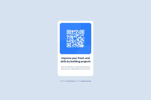
Submitted over 1 year agoA solution to the QR code component challenge
Responsive Qr code
accessibility
@Adebukol

Solution retrospective
What are you most proud of, and what would you do differently next time?
I was proud of coming back to coding, it's been a long time. It was really a memory refresh and fun at the same time.
What challenges did you encounter, and how did you overcome them?I had forgotten some stuff honestly. W3 school was able to help out. Thumbs up
Code
Loading...
Please log in to post a comment
Log in with GitHubCommunity feedback
No feedback yet. Be the first to give feedback on Adebukola Adeyinka Omowole's solution.
Join our Discord community
Join thousands of Frontend Mentor community members taking the challenges, sharing resources, helping each other, and chatting about all things front-end!
Join our Discord