

Design comparison

Solution retrospective
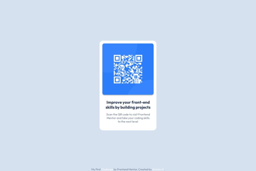
I'm pretty stoked about keeping my CSS in its own file. Yeah, the code is tiny, but having that separate CSS file makes everything look way less like a hot mess. It's like giving my project a tidy-up, and who doesn’t love a neat and clean workspace?
Next time, I’ll definitely crank up the responsiveness dial. I want to make sure my site looks fab on every device, from phone to tablet to that giant screen your grandma uses. Also, I’m thinking of diving into some of those fancy CSS techniques—because, let’s be honest, who doesn’t want to sound like they’re speaking in code wizardry?
What challenges did you encounter, and how did you overcome them?One of the big challenges was getting the layout just right. I was wrestling with some tricky positioning issues. But I tackled it by playing around with Flexbox and finally got everything looking sharp. It was like fighting a coding dragon, but I came out on top!
What specific areas of your project would you like help with?I'm looking for a hand with making my site more responsive across different devices. If anyone has tips on fine-tuning Flexbox or dealing with tricky layout issues, I’d love to hear them. Also, any feedback on improving my CSS organization would be awesome!
Community feedback
- @MikDra1Posted 2 months ago
If you want to get rid of overflow on the x axis here is how to do this:
(body could be also a .container)
body {
overflow-x: hidden;
}
Hope you found this comment helpful 💗💗💗
Good job and keep going 😁😊😉
Marked as helpful0 - @Islandstone89Posted 2 months ago
Hi there, well done!
These are my suggestions for improving your solution - I hope you find them helpful :)
HTML:
-
I would change the heading to a
<h2>- a page should only have one<h1>, reserved for the main heading. As this is a card heading, it would likely not be the main heading on a page with several components. -
Text should always be wrapped in a meaningful element, never in divs or landmark elements alone. Hence, the footer text needs to be wrapped in a
<p>.
CSS:
-
Including a CSS Reset at the top is good practice.
-
I would recommend adding
1remofpaddingon thebody, to ensure the card doesn't touch the edges on small screens. -
On the
body, changeheighttomin-height- this way, the content will not get cut off if it grows beneath the viewport. I would also addflex-direction: columnandgap: 2rem, to create some space between the<main>and the<footer>. Hence, I would removeposition: fixedon the footer. Also, remove thewidth- the body is a block element, meaning it takes up the full width by default. -
max-widthon the card should be in rem. Around20remwill work fine. -
Remove all widths, max-widths and heights in
px. -
font-sizemust never be in px. This is a big accessibility issue, as it prevents the font size from scaling with the user's default setting in the browser. Use rem instead. -
Paragraphs have a default value of
font-weight: 400, so there is no need to declare it. -
Since all of the text should be centered, you only need to set
text-align: centeron the body, and remove it elsewhere. The children will inherit the value. -
On the image, add
display: blockandmax-width: 100%- the max-width prevents it from overflowing its container. Without this, an image would overflow if its intrinsic size is wider than the container.max-width: 100%makes the image shrink to fit inside its container. -
The footer links have very poor contrast, so I would make them a darker color.
Marked as helpful0@Grimm-NPosted 2 months ago@Islandstone89 Thank you for your suggestions, I really appreciate it! I will definitely review and improve this code.
1 -
- @Vukasin-StosicPosted 2 months ago
Excellent job, you nailed it.
0


Please log in to post a comment
Log in with GitHubJoin our Discord community
Join thousands of Frontend Mentor community members taking the challenges, sharing resources, helping each other, and chatting about all things front-end!
Join our Discord