

Design comparison

Community feedback
- @solvmanPosted 10 months ago
Very well done! 🎊🎉🚀
Great job using the
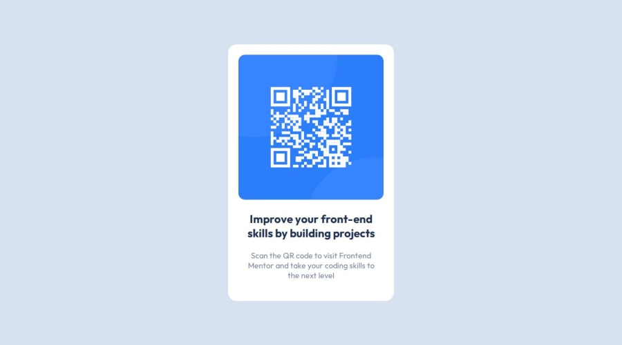
<main>tag. Use semantic HTML elements instead of plain<div>elements for better accessibility. I have suggestions on how you may improve your project. First, the<main>element represents the dominant content of the<body>and expands on the central topic of the document. Such widgets as cards are more suited to be constructed with the<article>element, which encapsulates reusable, self-contained content. Titles and heading are normally denoted by<h1>,<h2>,<h3>and so on. Do not skip headings. Regular text is normally encapsulated by<p>.With that being said, I would redo your code as so:<body> <main> <article class="card"> <img class="qrCode" src='images/image-qr-code.png'> <h1 class="title">Improve your front-end skills by building projects</h1> <p class="subtitle">Scan the QR code to visit Frontend Mentor and take your coding skills to the next level</p> </article> </main> </body>All elements within the
<article>are block-level elements except for<img>.It is good practice to add the following reset to your<img>:img { display: block; max-width: 100%; }All the elements are block-level elements and will stack one on top of the other naturally, so there is no need to use Flexbox. 😄
I like your idea of using Flexbox on
<body>to center the card. There is a minor issue with usingheight: 100vh. With the height of the viewport being less than the minimum size of your card's contents, you start having content clipped on top and bottom. You can avoid that by addingmin-height: 600pxor using the max(100vh, 600px) function. The function will return the bigger value of the two options provided. If the viewport window is smaller than 600px, it will add a scroll bar and keep the body at a minimum of 600px high. Also, I like using Grid to place content in the middle of the screen. It is just one line shorter. I would do something like that:body { height: max(100vh, 600px); /* will have have of 100vh if bigger then 600px */ display: grid; place-content: center; }Otherwise, very well done 🚀 Keep it up 👍
0

Please log in to post a comment
Log in with GitHub
Join our Discord community
Join thousands of Frontend Mentor community members taking the challenges, sharing resources, helping each other, and chatting about all things front-end!
Join our Discord