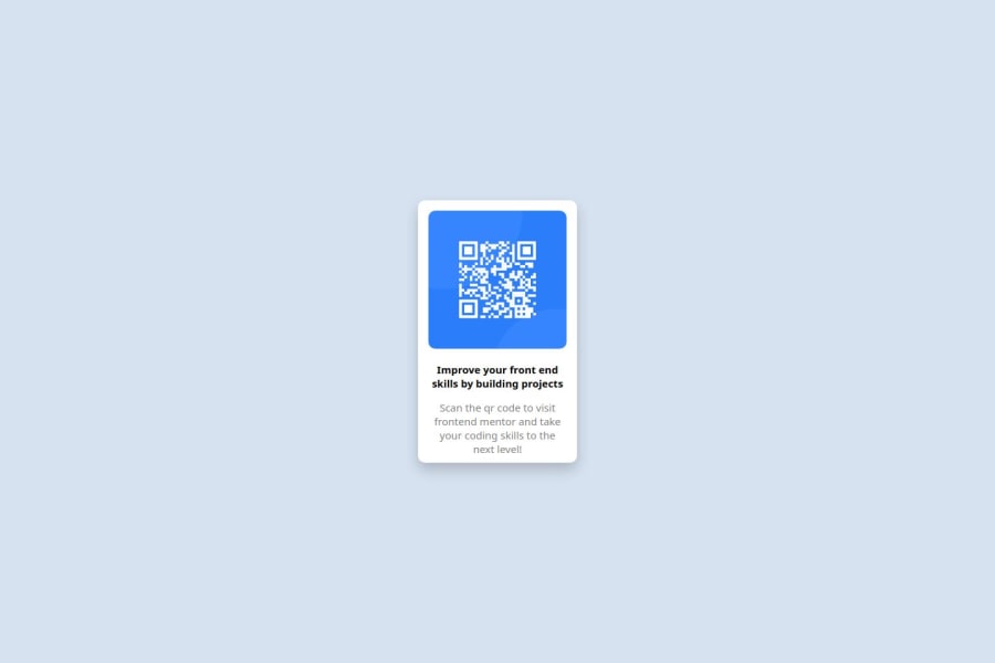
Design comparison
SolutionDesign
Solution retrospective
What are you most proud of, and what would you do differently next time?
I am proud to have succesfully applied my knowledge in CSS Flexbox to live and I am looking to imorove my knowledge and understanding of figma.
What challenges did you encounter, and how did you overcome them?Because I am not used to designing using figma files, I was a little bit slowed down.
What specific areas of your project would you like help with?I think I am good with this project because it was meant for starters.
Community feedback
Please log in to post a comment
Log in with GitHubJoin our Discord community
Join thousands of Frontend Mentor community members taking the challenges, sharing resources, helping each other, and chatting about all things front-end!
Join our Discord
