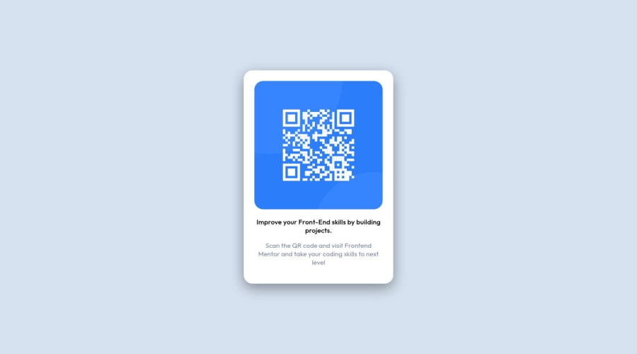
Responsive QR code project using CSS and HTML
Design comparison
Solution retrospective
This is one of my first projects of Web Development. I would like anybody to comment on it. Feel free to give any kind of suggestions. Specifically, I would like to have some suggestions on responsiveness. Please help me to make my code better so I can improve in upcoming projects!
Community feedback
- @denieldenPosted almost 3 years ago
Hi Ritam, I took some time to look at your solution and you did a great job!
Also I have some tips for improving your code:
- add
main
tag and wrap the card for Accessibility - Centering a
div
withabsolute
positioning is now deprecated, it uses modern css likeflexbox or grid
- try to use flexbox to the body for center the card. Read here -> best flex guide
- after add
min-heigth: 100vh
to body because Flexbox aligns to the size of the parent container
Overall you did well :)
Hope this help and happy coding!
Marked as helpful1@ritam-mishraPosted almost 3 years ago@denielden I tried to use flexbox but I was unable to make the card in the centre. So I decided to use positioning as absolute. Thanks for your time as you went through my code with patience. I will surely try your way of approach and give you the feedback. Thanks... it was super helpful.
1@ritam-mishraPosted almost 3 years ago@denielden Also can you help me by telling why do we need to give an alt for the qr image that is being used here? Why is the alt tag important to use?
1@denieldenPosted almost 3 years ago@ritam-mishra You are welcome!
It is important to use the
alt
attribute because if the image is not found, the content of the attribute will appear. It is also important for accessibilityKeep it up :)
Marked as helpful1 - add
- @omar-azzam-devPosted almost 3 years ago
Hi Ritam,
You can use main tag instead of div with main class, which is better for accessibility.
resources:
https://www.w3schools.com/accessibility/accessibility_intro.php https://www.w3schools.com/accessibility/accessibility_semantic_elements.php https://developer.mozilla.org/en-US/docs/Web/Accessibility?retiredLocale=ar
Happy Coding ❤️!
Marked as helpful1@ritam-mishraPosted almost 3 years ago@omar-azzam-dev I will go through all of the links and surely learn about accessibility. I am unaware of the accessibility problems, so I will definetly watch your suggestions to improve my code.
0 - Account deleted
Hello there! 👋
Congratulations on finishing your challenge! 🎉
I have some feedback on this solution:
- Always Use Semantic HTML instead of
div
like<main>
<header>
<footer>
, etc for more info
i hope this is helpful and goodluck!
Marked as helpful1@ritam-mishraPosted almost 3 years ago@Old1337 Thank You, as you commented on my post and saw my code. Yes, I could have used the main tag. I was unaware of this tag at first. You were the one to let me know about this and so I am very much thankful. I will surely use your feedback to make my code better.
1 - Always Use Semantic HTML instead of
Please log in to post a comment
Log in with GitHubJoin our Discord community
Join thousands of Frontend Mentor community members taking the challenges, sharing resources, helping each other, and chatting about all things front-end!
Join our Discord