Design comparison
SolutionDesign
Community feedback
- @IvanzkaaPosted 8 months ago
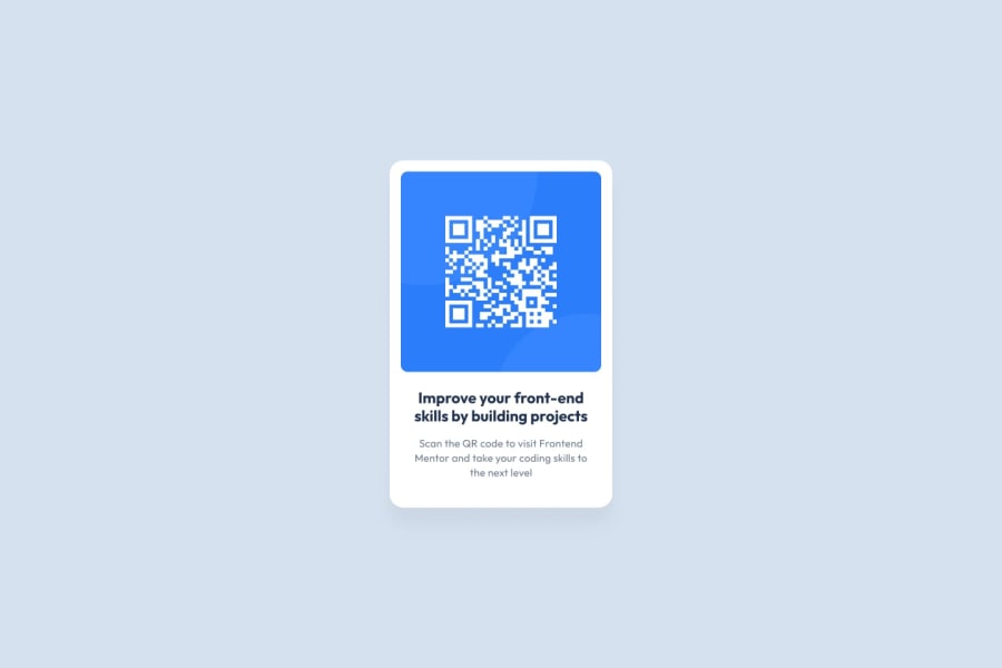
I would add more padding round the white container of the card and around the text. I would also change the heading of the primary text of the card and change the color of the secondary text. The other thing that I advise is to make the card bigger so that the layout looks more structured.
0
Please log in to post a comment
Log in with GitHubJoin our Discord community
Join thousands of Frontend Mentor community members taking the challenges, sharing resources, helping each other, and chatting about all things front-end!
Join our Discord
