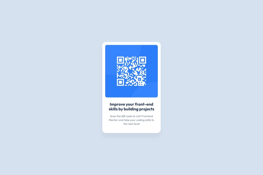
Design comparison
SolutionDesign
Solution retrospective
it was pretty easy for me as a beginner
Community feedback
- @YinkajayPosted 12 months ago
The heading's text color should match the dark blue
hsl(218, 44%, 22%)from the design images instead of the current black color.Furthermore, consider center-aligning all text elements (heading and paragraph) using
text-align: centerin the CSS to maintain consistent alignment throughout.Additionally, the QR card appears slightly narrower than the design's specifications, suggesting a need for adjustment in its width.
Apart from these minor issues, your solution rocks!
Marked as helpful1@is3hhhhhPosted 12 months ago@Yinkajay thank you mate i didnt notice really the heading color
1
Please log in to post a comment
Log in with GitHubJoin our Discord community
Join thousands of Frontend Mentor community members taking the challenges, sharing resources, helping each other, and chatting about all things front-end!
Join our Discord
