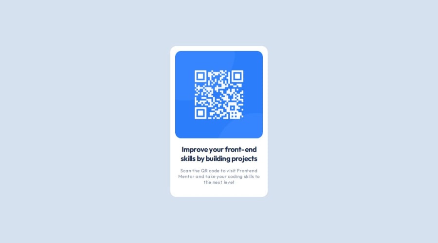
Design comparison
Solution retrospective
This is my first challenge for me in Frontend Mentor and it was so easy, and I'm looking forward for the next challenges.
What challenges did you encounter, and how did you overcome them?The only challenge is that I couldn't get all padding or margin sizes from design, so I approximate it as I can see :)
What specific areas of your project would you like help with?Maybe in the next challenges I'll need help :)
Community feedback
- @danielmrz-devPosted 7 months ago
Hello, @hoda257!
Your project is looking fantastic!
I'd like to suggest a way to make it even better:
- Using
positionisn't always the most effective method for centering an element. It can cause bugs and may resylt in part of the content being cut off on smaller screens.
Here's a highly efficient approach to position an element at the center of the page both vertically and horizontally:
📌 Apply this CSS to the body (avoid using
positionormarginsin order to work correctly):body { min-height: 100vh; display: flex; justify-content: center; align-items: center; }I hope you find this helpful!
Keep up the excellent work!
Marked as helpful0 - Using
Please log in to post a comment
Log in with GitHubJoin our Discord community
Join thousands of Frontend Mentor community members taking the challenges, sharing resources, helping each other, and chatting about all things front-end!
Join our Discord
