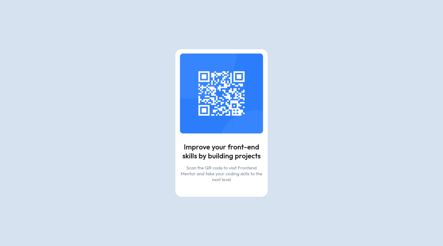
Responsive QR code landing page
Design comparison
Community feedback
- @IDev11Posted about 2 years ago
Hi @regal-shabazz, how are you?
You did a great job on this challenge, but I have a few tips that I think you'll like.
1- Document should have one main landmark, you could have put all the content inside the main tag check this https://dequeuniversity.com/rules/axe/4.3/landmark-one-main?application=axeAPI
2- You can use relative units as rem or em that have a better fit if you want your site more accessible between different screen sizes and devices. REM and EM does not just apply to font size, but to all sizes as well.
The rest is good, I hope it helps!!
Marked as helpful0@regal-shabazzPosted about 2 years ago@IDev11 Thank you so much for response. I honestly do not know what landmarks are but i'll make sure to look it up and adjust my code. Thanks alot for your feedback.
1 - @correlucasPosted about 2 years ago
👾Hello Babatunde, Congratulations on completing this challenge!
Nice solution and nice code! I can see that you paid a lot of attention to your code/design. If you don’t mind I’ve some tips for you:
Your html code is not optimized yet, since its too long and have some unnecessary elements. To make it clean you start by removing some unnecessary
<div>. For this solution you wrap everything inside a single block of content using<div>or<main>(better option for accessibility) and put inside the whole content<img>/<h1>and<p>.<body> <main> <img src="./images/image-qr-code.png" alt="Qr Code Image" > <h1>Improve your front-end skills by building projects</h1> <p>Scan the QR code to visit Frontend Mentor and take your coding skills to the next level</p> </main> </body>✌️ I hope this helps you and happy coding!
0
Please log in to post a comment
Log in with GitHubJoin our Discord community
Join thousands of Frontend Mentor community members taking the challenges, sharing resources, helping each other, and chatting about all things front-end!
Join our Discord
