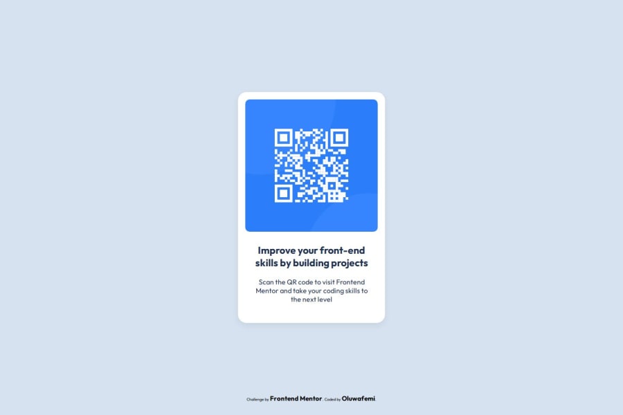
Design comparison
SolutionDesign
Solution retrospective
What are you most proud of, and what would you do differently next time?
Im proud of the fact that i was able to make it responsive and i will like to improve the way i write my code.
What challenges did you encounter, and how did you overcome them?i had issues making it still okay on mobile screens but by the help of my tutor Mr Tega i was able to solve the problem.
What specific areas of your project would you like help with?Responsiveness
Community feedback
Please log in to post a comment
Log in with GitHubJoin our Discord community
Join thousands of Frontend Mentor community members taking the challenges, sharing resources, helping each other, and chatting about all things front-end!
Join our Discord
