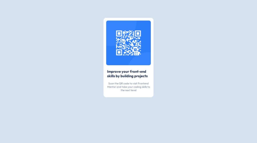
Design comparison
Solution retrospective
I'm proud to have chosen this career path and I would like to be better
What challenges did you encounter, and how did you overcome them?Fear to start a project or seeing it as what I can not do
Community feedback
- @6xg0dPosted about 1 year ago
Hey! That's a great start. Glad you decided to start learning Web Development Adeniyi! I'm not an expert, but after review your code i'd like to give you a couple tips that help me to code and to keep in mind:
-
Write CSS in a separate file: It's quiet common to write a few CSS styles in the HTML element while learning our first steps in HTML, but it's highly recommended to start writing your CSS rules in a separate stylesheet instead of the HTML document itself. More organize and easy to read especially in projects with a significative amount of lines of code.
-
Get used to write semantic code: It's important to give our content a semantic meaning, not just for good practices, but for accesibility too. Try to deconstructure your projects in smaller pieces, and start to section every part you think necessary to build you solution. In this case, think about the card: It has a header? A footer? What it's the semantic structure of this card? There's no one "correct" way to define a semantic structure, but a good semantic structure has to make senses to every developer who review your code!
-
Talking about fear: Everybody had the same feeling at the beginning, and it's ok! Trying to learn something new can be hard, stressful, but at the same time rewarding and joyful! Just keep in mind that you're not going to know everything, but you need to be willing to learn as much as you can about this world :)
Here are some sources that i'm currently using to learn and hope it helps you too:
- https://www.w3schools.com/
- https://web.dev/
- https://developer.mozilla.org/en-US/docs/Learn/Accessibility
0 -
- @01057057kimPosted about 1 year ago
I noticed that your card is not in the middle of the page. Here's a very efficient way to center the card:
Apply this to the body (in order to work properly, don't use position or margins):
body {
    min-height: 100vh;
    display: flex;
    justify-content: center;
    align-items: center;
}
I hope it helps!
0
Please log in to post a comment
Log in with GitHubJoin our Discord community
Join thousands of Frontend Mentor community members taking the challenges, sharing resources, helping each other, and chatting about all things front-end!
Join our Discord
