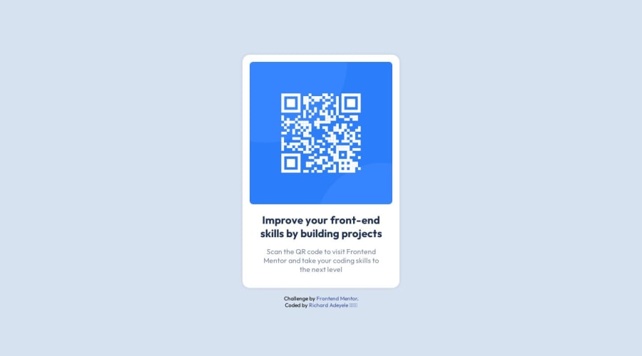
Design comparison
Solution retrospective
I would love to know a better way to scale the card across devices. I wasn't sure of how to center the card vertically, would love insight on how to fix that.
Thank you
Community feedback
- @0xabdulkhaliqPosted over 1 year ago
Hello there 👋. Congratulations on successfully completing the challenge! 🎉
- I have other recommendations regarding your code that I believe will be of great interest to you.
CSS 🎨:
- Looks like the component has not been centered properly. So let me explain, How you can easily center the component without using
margin
orpadding
.
- We don't need to use
margin
andpadding
to center the component both horizontally & vertically. Because usingmargin
orpadding
will not dynamical centers our component at all states
- To properly center the component in the page, you should use
Flexbox
orGrid
layout. You can read more about centering in CSS here 📚.
- For this demonstration we use css
Grid
to center the component.
body { min-height: 100vh; display: grid; place-items: center; }
- Now remove these styles, after removing you can able to see the changes
.card { margin: auto; margin-top: 8%; }
- Now your component has been properly centered
.
I hope you find this helpful 😄 Above all, the solution you submitted is great !
Happy coding!
Marked as helpful1 - @HassiaiPosted over 1 year ago
Replace<div class="container">with the main tag, <p class="header"> with <h1> and <div class="attribution"> with the footer tag to make the page accessible. click here for more on web-accessibility and semantic html
Every html must have <h1> to make it accessible. Always begin the heading of the html with <h1> tag wrap the sub-heading of <h1> in <h2> tag, wrap the sub-heading of <h2> in <h3> this continues until <h6>, never skip a level of a heading.
For a responsive content replace the width in .card with
max-width
.To center .card on the page using flexbox or grid instead of margin:
- USING FLEXBOX: add min-height:100vh; display: flex; align-items: center: justify-content: center; to the body
body{ min-height: 100vh; display: flex; align-items: center; justify-content: center; }
- USING GRID: add min-height:100vh; display: grid place-items: center to the body
body{ min-height: 100vh; display: grid; place-items: center; }
Use relative units like rem or em as unit for the padding, margin, width values and preferably rem for the font-size values, instead of using px which is an absolute unit. For more on CSS units Click here and here
Hope am helpful.
Well done for completing this challenge. HAPPY CODING
Marked as helpful1 - @WeberowskyPosted over 1 year ago
To scale the card across devices you could use
vw
andvh
(Viewport Width, Height) or some other relative values likerem
. On some bigger projects if you'd need to change position of the element when its on mobile you could use the media ruleMarked as helpful1 - @devjhexPosted over 1 year ago
@Richlee-demo According to your code it would be better to make the body element a display of flex and the other properties below so as to center the card easily as shown below.
body { display:flex; justify-content:center; align-items:center; flex-direction:column; }
Hope you would find this helpful.
Happy coding and keep up with the spirit.
Marked as helpful1
Please log in to post a comment
Log in with GitHubJoin our Discord community
Join thousands of Frontend Mentor community members taking the challenges, sharing resources, helping each other, and chatting about all things front-end!
Join our Discord