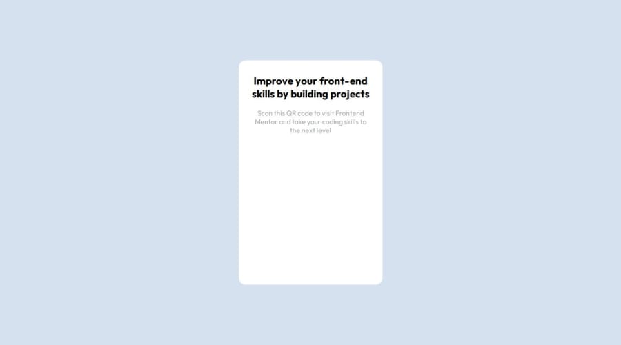
Design comparison
SolutionDesign
Solution retrospective
What are you most proud of, and what would you do differently next time?
I would like to design first then make because sometimes paremeter issue I have noticed from my end so far.
What challenges did you encounter, and how did you overcome them?The challenge was to center the card container to the center but I then managed to make it center plus responsive.
What specific areas of your project would you like help with?The areas to create a design using Figma is challenge since my laptop hangs due to less RAM and memory which already is running VS Code and browser in behind.
Community feedback
Please log in to post a comment
Log in with GitHubJoin our Discord community
Join thousands of Frontend Mentor community members taking the challenges, sharing resources, helping each other, and chatting about all things front-end!
Join our Discord
