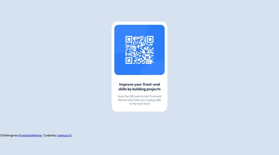
Design comparison
Solution retrospective
Most proud of being able to follow some specifications from the study guide
What challenges did you encounter, and how did you overcome them?Issues with basically adjusting everything to where it's supposed to be in the Div but mostly adjusted with Margins and paddings
Community feedback
- @Sonu-DuttaPosted 9 months ago
Congratulations on completing the solution! It looks great! One thing I would like to highlight: To ensure the
justify-content: centerproperty works correctly, use thedisplay: flexproperty. For more information, you can refer to the [https://www.w3schools.com/css/css3_flexbox_container.asp].Marked as helpful1 - P@MikDra1Posted 7 months ago
I encourage you to use this technique to make the card responsive with ease:
.card {
width: 90%;
max-width: 600px;
}
On the smaller screens card will be 90% of the parent (here body), but as soon as the card will be 600px it will lock with this size.
Also to put the card in the center I advise you to use this code snippet:
.container {
display: grid;
place-items: center;
}
Hope you found this comment helpful 💗💗💗
Good job and keep going 😁😊😉
Marked as helpful0
Please log in to post a comment
Log in with GitHubJoin our Discord community
Join thousands of Frontend Mentor community members taking the challenges, sharing resources, helping each other, and chatting about all things front-end!
Join our Discord
