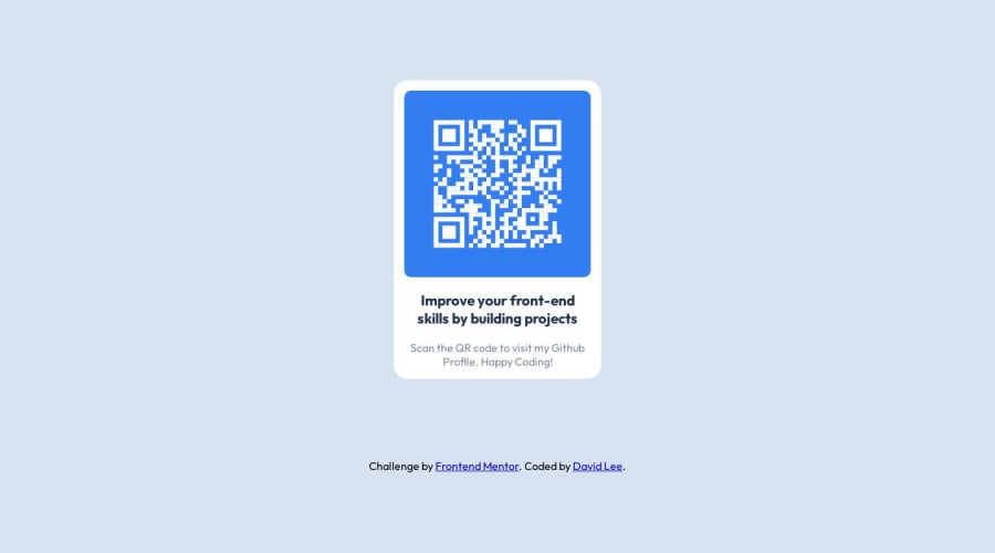
Design comparison
Community feedback
- @Islandstone89Posted 12 months ago
Hey, here is some feedback.
HTML:
-
You need a
<main>, this is important for accessibility. I would simplify the structure a bit. You don't need an<article>,<section>or a<figure>. Change.qr-containerinto a<main>, and have an<img<, a<h1>and a<p>inside of it. -
Alt text should be changed to ``alt="QR code that leads to frontendmentor.io".
CSS:
-
Performance-wise, it's better to link fonts in the
<head>of the HTML then using@import. -
It's good practice to include a CSS Reset at the top.
-
Font-size must never be in px. Use rem instead.
-
On
body, changeheight: 100vhtomin-height: 100vhandjustify-content: space-evenlytojustify-content: center. -
Remove the fixed width and height on the card. You rarely want to set fixed dimensions, as this easily creates issues with responsiveness.
-
Remove
margin: 0 auto- the card is already centered horizontally and vertically using Flexbox. -
The image shouldn't have any
widthorheight. It needs adisplay: blockand amax-width: 100%. Themax-widthprevents the image from spilling out of the card. -
Remove all the properties set on the text. You don't need to use Flexbox for this, and you definitely don't want to set a height.
-
Global styles that affect all of the elements should be set on the body. Since all of the text is center-aligned, you should set
text-align: centeron the body only.
Marked as helpful0 -
Please log in to post a comment
Log in with GitHubJoin our Discord community
Join thousands of Frontend Mentor community members taking the challenges, sharing resources, helping each other, and chatting about all things front-end!
Join our Discord
