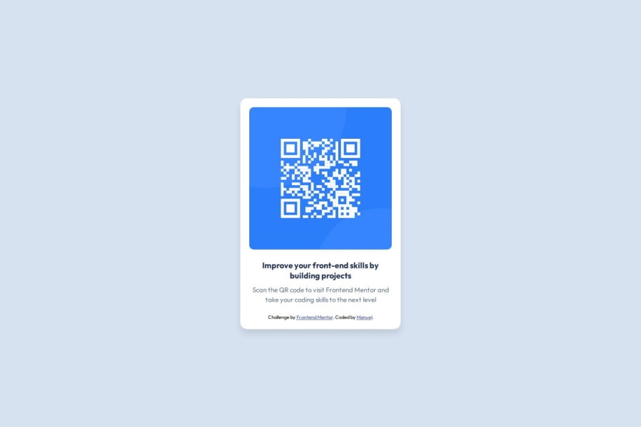


Design comparison

Solution retrospective
I'm proud to have successfully implemented the design to create a fully responsive QR code component. This project helped me sharpen my front-end development skills, particularly in using modern CSS techniques for layout and styling, as well as ensuring that the design adapts well across different screen sizes. I also effectively implemented accessibility features by keeping the text legible and ensuring the overall structure meets WCAG standards.
Next time, I would focus more on perfecting the alignment and spacing details to exactly match the design specifications. I’d also like to explore using CSS Grid for layout management rather than just Flexbox to see if it would offer a more precise way to handle alignment and responsiveness.
What challenges did you encounter, and how did you overcome them?Challenge 1: Centering and alignment issues One of the main challenges I faced was getting the text and elements to align exactly as shown in the design. Ensuring the design was pixel-perfect and responsive across different devices was a bit tricky. To overcome this, I spent time revisiting my CSS, experimenting with Flexbox properties, and using margin and padding adjustments to fine-tune the alignment. Testing across different screen sizes also helped me identify where adjustments were necessary.
Challenge 2: Ensuring responsiveness Another challenge was making sure the layout remained fully responsive while maintaining its design integrity. At first, the component didn’t scale well on smaller screen sizes. I resolved this by using media queries and setting flexible widths to ensure the design was fluid across various devices.
Challenge 3: Matching the design exactly Replicating the exact visual look from the design, especially with the spacing and font size, was more challenging than expected. I learned that even small differences in spacing or font-weight could drastically affect the final look. I overcame this by reviewing the design specifications more carefully and adjusting my CSS to reflect the correct value.
What specific areas of your project would you like help with?What specific areas of your project would you like help with?
-
Responsiveness and Cross-browser Compatibility: While the project works well on the devices I’ve tested, I’d appreciate feedback on how it behaves across a wider range of screen sizes and browsers. Specifically, any tips for optimizing responsiveness or cross-browser compatibility would be helpful.
-
Typography and Spacing: I'm seeking feedback on the accuracy of the typography and spacing compared to the original design. Any suggestions on how I can make the text alignment and spacing even more precise would be greatly appreciated.
-
CSS Structure and Best Practices: I'd love input on how I’ve structured my CSS. Are there any ways to optimize my CSS for better maintainability or performance? I’m also interested in learning if there are any best practices I missed.
-
Improving Code Readability: I’d appreciate any feedback on improving the readability of my code. Are there specific areas where my code could be refactored for clarity or efficiency?
-
Performance Optimization: Finally, I'd like guidance on any opportunities for performance optimization. Are there any areas where I could reduce unnecessary code or improve load times?
Community feedback
- @grace-snowPosted 7 months ago
Have a look at the feedback I've left on others solutions to this like this one as a lot of the same issues apply to yours: https://www.frontendmentor.io/solutions/html5-css-and-flexbox-aXZTaM1HQ3
Also note the attribution should not be inside the card component. This card should be inside a
mainlandmark and the attribution should be in afooterlandmark.This doesn't need a media query. And the text all looks too small in this. Try to get it much closer to the original design. You can even access the figma file I think so there's no reason for there to be any differences
0@Manuel7070Posted 7 months ago@grace-snow Thanks for the feedback, I am working on the changes you suggested. Thanks
0


Please log in to post a comment
Log in with GitHub
Join our Discord community
Join thousands of Frontend Mentor community members taking the challenges, sharing resources, helping each other, and chatting about all things front-end!
Join our Discord