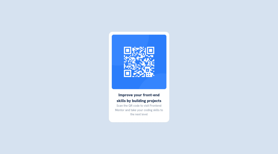
Design comparison
Solution retrospective
i want to make it accurate as it is showed in the design
What challenges did you encounter, and how did you overcome them?I learned more about websites layout.
I used this media query to make it responsive for desktop screen:
/* for desktop size 1440px */ @media only screen and (min-width: 1440px) { main{ margin-top: 20vh; } }
What specific areas of your project would you like help with?idk any feedbacks are appreciated
Community feedback
- @Bader-IdrisPosted almost 2 years ago
You can set the container in the middle of the screen whatever user changes it when you add these properties to it in CSS:
.container {
  display: absolute;
  top:50%;
  left: 50%;
  transform: translate(-50%, -50%);
}
the new feature is transform, it has many lovely properties you can discover, I personally love it. Hope it's useful
Marked as helpful1
Please log in to post a comment
Log in with GitHubJoin our Discord community
Join thousands of Frontend Mentor community members taking the challenges, sharing resources, helping each other, and chatting about all things front-end!
Join our Discord
