

Design comparison

Solution retrospective
I am most proud of achieving a fully responsive layout that adapts well to different screen sizes using only CSS Flexbox. Next time, I would focus on improving my code organization by using SCSS or a CSS methodology like BEM.
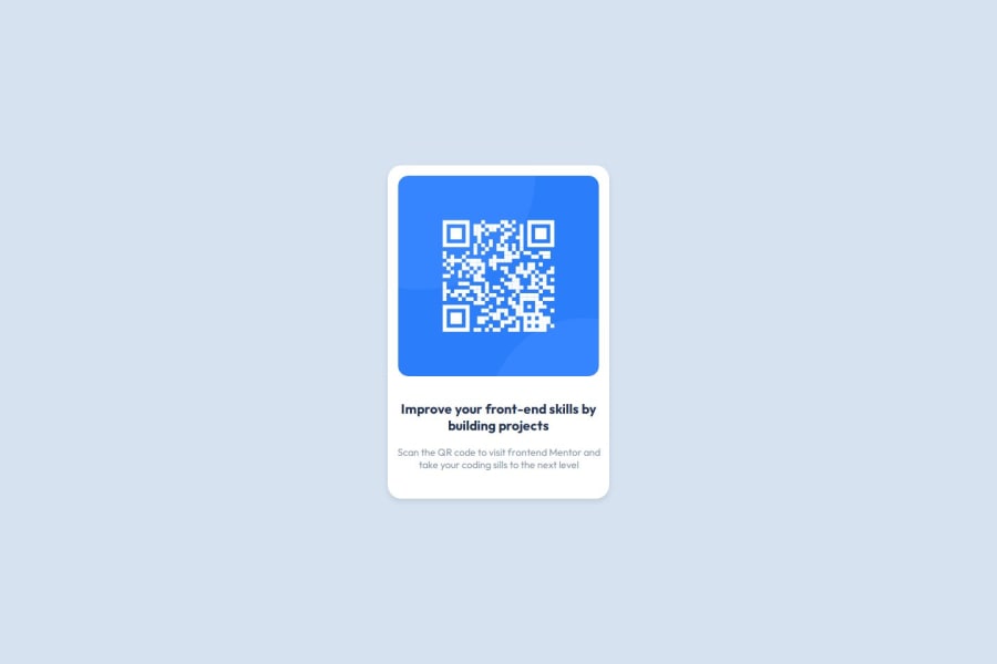
What challenges did you encounter, and how did you overcome them?One of the biggest challenges was aligning the QR code component precisely at the center of the viewport. I overcame this by experimenting with CSS Flexbox properties like justify-content: center and align-items: center. I also faced initial deployment issues but resolved them by configuring my GitHub Pages settings properly.
What specific areas of your project would you like help with?I would appreciate feedback on improving semantic HTML and suggestions on how to write more efficient and scalable CSS for small projects like this one.
Community feedback
- @Codeman-pikluPosted 3 months ago
Yes, the solution uses semantic HTML elements such as <header>, <h1>, <h2>, and <p> where appropriate. However, further improvements could include adding <main> to wrap the primary content for better document structure and screen-reader navigation.
The solution incorporates basic accessibility features such as proper semantic tags and a clean visual hierarchy. To improve accessibility:
Add alt text for all images to describe their content for screen readers.
Ensure sufficient contrast between text and background colors for better readability.
Use ARIA roles and attributes where necessary to enhance assistive technology support.
3. Yes, the solution is responsive and adjusts well to different screen sizes. It uses CSS Flexbox and Grid, ensuring adaptability. However, testing on extremely small screens or devices with unusual aspect ratios might help identify edge cases to refine further.
The code is mostly well-structured with proper use of variables for colors and consistent indentation. To improve reusability:
Group similar styles into reusable CSS classes.
Avoid inline styles and ensure all styling is defined in the external stylesheet.
Consider organizing the CSS file into sections (e.g., typography, layout, components) for better readability.
5. The solution aligns closely with the design provided by Frontend Mentor, including the layout and styling. Any minor deviations might include hover effects or font sizes that differ slightly from the design. These can be fine-tuned by cross-referencing with the design specifications.
0

Please log in to post a comment
Log in with GitHub
Join our Discord community
Join thousands of Frontend Mentor community members taking the challenges, sharing resources, helping each other, and chatting about all things front-end!
Join our Discord