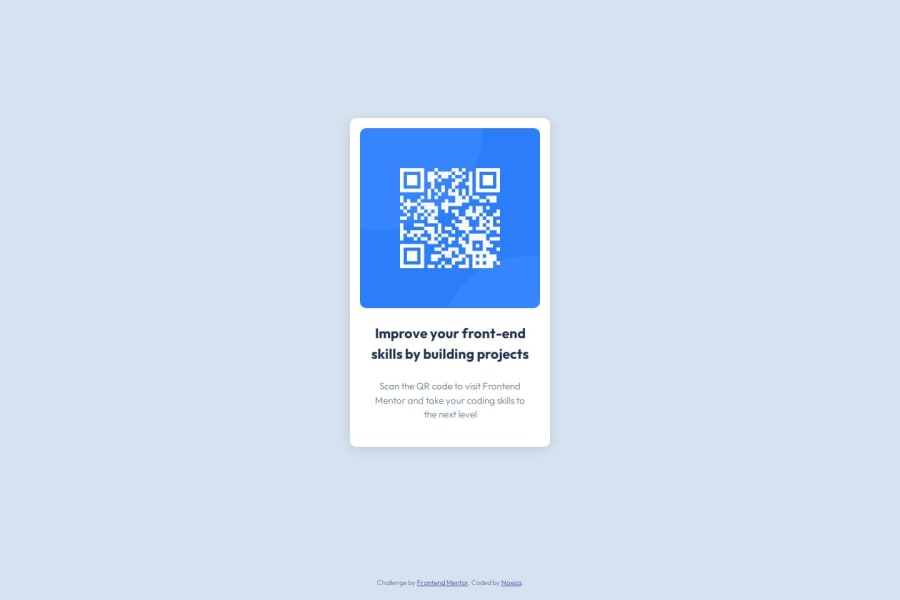
Responsive QR Code Component with CSS Grid & Flexbox (html, css)


Design comparison

Solution retrospective
I’m proud of having completed my very first Frontend Mentor challenge and setting up the full workflow with Git and GitHub. I took the time to organize my files, write clean code, and follow a mobile-first approach.
Next time, I would try to deploy the site earlier in the process to avoid last-minute issues. I’d also automate some tasks like committing changes more efficiently (I started working on a custom script for that!).
What challenges did you encounter, and how did you overcome them?I ran into several Git-related issues: managing .gitignore, understanding the difference between master and main, and getting my repo clean and ready to push. I also had to troubleshoot problems with ignored files being committed anyway. With some research and support, I fixed the branch issue and cleaned up the repo structure.
What specific areas of your project would you like help with?I’d love feedback on: • My file structure and naming conventions • CSS organization: could it be cleaner or more efficient? • Any improvements I could make for better accessibility or responsiveness
Community feedback
- P@mkerr-githubPosted 6 days ago
"I’d love feedback on: • My file structure and naming conventions • CSS organization: could it be cleaner or more efficient? • Any improvements I could make for better accessibility or responsiveness"
Hi, was going to give a little feedback, but your code is not showing up at the link you've provided.
0@Noxica17Posted 6 days ago@mkerr-github Thanks! The GitHub link was wrong, I’ve updated it !
0P@mkerr-githubPosted 5 days ago@Noxica17
Link working now.
Great job on showing the desktop and mobile screenshot in the readme.md file !
You're file structure, naming conventions and organisation are just fine for this small project. It comes with practice. Your alt tag is fine and can be shorter if you wish. The text will show up if the image is not available and it will also be read out by a screenreader for those with sight difficulties.
Respsonsiveness is more part of the next challenges. To prep go through these two articles on W3 schools :
https://www.w3schools.com/cssref/func_clamp.php
https://www.w3schools.com/html/html_responsive.asp
For responsive purposes the convention is to convert pixel measurements to "rem", to do so divide them by 16 (as the base rem is 16px, and 16px is set by most users as the default font size on browsers).
Then use max-width to set the large size and min-width to set the small size.
The convention is to use rem and sometimes em, instead of pixels for most items, as they are more responsive.
Pixels can still be used for small elements like icons and buttons where you do not want the size to change even on small screens.
As the Figma designs are in pixels, I find it easier to do my CSS in pixels first and then convert them all over to rem etc. when it looks ok.
More details here: https://austingil.com/px-or-rem-in-css/#:~:text=Pixels%20are%20an%20absolute%20unit,the%20equivalent%20of%2024%20pixels.
That's more than enough to give you at this stage and keep you going.
If you found anything in this comment helpful, please remember to click the "mark as helpful" button. Thank you!
Keep up the good work, and keep going! 👋
Marked as helpful0

Please log in to post a comment
Log in with GitHub
Join our Discord community
Join thousands of Frontend Mentor community members taking the challenges, sharing resources, helping each other, and chatting about all things front-end!
Join our Discord