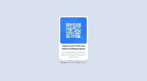
Design comparison
Solution retrospective
It's my first challenge, and I'm a bit uncomfortable because of the size of qr-code. I'll follow up with more challenges to be more confident... any feedback is welcome :)
Community feedback
- @danielmrz-devPosted 10 months ago
Hello @AgredaLuis!
Your solution looks great!
I have a couple of suggestions (about semantic HTML) for improvement:
π First: Use
<main>
to wrap the main content instead of<div>
.Tags like
<div>
and<span>
are typical examples of non-semantic HTML elements. They serve only as content holders but give no indication as to what type of content they contain or what role that content plays on the page.π Second: Use
<h1>
for the main title instead of<h2>
.Unlike what most people think, it's not just about the size and weight of the text.
- The
<h1>
to<h6>
tags are used to define HTML headings. <h1>
defines the most important heading.<h6>
defines the least important heading.- Only use one
<h1>
per page - this should represent the main heading/title for the whole page. And don't skip heading levels - start with<h1>
, then use<h2>
, and so on.
All these tag changes may have little or any visual impact but they make your HTML code more semantic and improve SEO optimization as well as the accessibility of your project.
I hope it helps!
Other than that, great job!
Marked as helpful1@AgredaLuisPosted 10 months agoHello @danielmrz-dev!
Thank you for your comment, it inspires me to keep trying. I would like to know, do you recommend a browser extension to improve accessibility and seo?
1@danielmrz-devPosted 10 months ago@AgredaLuis
Yes! Lighthouse and AxeDevTools are good extensions that can help you with those π
I use both of them!
Marked as helpful0 - The
Please log in to post a comment
Log in with GitHubJoin our Discord community
Join thousands of Frontend Mentor community members taking the challenges, sharing resources, helping each other, and chatting about all things front-end!
Join our Discord