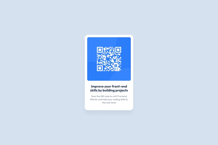
Design comparison
Solution retrospective
I am excited to have completed my first challenge on Frontend mentor. This is more of a platform eye-opener than a skill test project, and I look forward to taking on more projects that will help me sharpen my skills.
What challenges did you encounter, and how did you overcome them?Thankfully, I did not encounter any challenges.
What specific areas of your project would you like help with?I would appreciate your feedback on my solution - code optimization suggestions and highlights on anything I didn't do right, all constructive criticisms are welcomed.
Community feedback
- @KapteynUniversePosted 29 days ago
Hey, nice job. Ok, from top to bottom :D
For the challenges on here, it is probably not needed but using colors, font-weights, sizes etc. as variables would be a good practice. Like:
:root {
  /* Primary */
  --dark-cyan: hsl(158, 36%, 37%);
  --cream: hsl(30, 38%, 92%);
  /* Neutral */
  --very-dark-blue: hsl(212, 21%, 14%);
  --grayish-blue: hsl(228, 12%, 48%);
  --white: hsl(0, 0%, 100%);
  --fs-p: .875rem;
  --fw-500: 500;
  --fw-montserrat-700: 700;
}
and then you can use them for styling like
background-color: var(--cream);. These things may change in a real project, so when it does all you have to do is change them from the root instead of searching in the whole css file/s.--creamis a custom name btw, you can name it anything you want. But for readability giving it a meaningful name would be beter.Using a modern css reset for the future challenges will help you.
You can use flex or grid for centering.
body {
display: flex;
justify-content: center;
align-items: center;
min-height: 100vh;
}
or
body {
display: grid;
place-content: center;
min-height: 100vh;
}
Avoid using hard coded values, like
width: 275px;usemax-width: 275px;instead,max-width: 20rem;would be even better. Em/rem units are better for responsiveness. I recommend you to check Kevin Powell's this video for better understanding.Imgs need to have meaningful alt text, except for the decorative imgs. You already wrote something but i think it needs a little bit more context. Like "QR Code - Scan to access Frontendmentor.io" It might confuse the screen reader users, like access to what?
This component is for to use in a web page and every page should only have one h1(mostly). This is a simple product card, it would never be used to serve the main heading on a page, using a h2 for h1 would be better. But on the future challenges doing this will give you a warning on the HTML report when you submit a solution. If it bugs you, you can create a h1 with some text and make it for screen reader only.
Marked as helpful1@UnifiesPosted 29 days ago@KapteynUniverse This is a great guide, I learnt a lot just reading through. I'll implement these changes in optimizing my code, thank you so much for the feedback!
1
Please log in to post a comment
Log in with GitHubJoin our Discord community
Join thousands of Frontend Mentor community members taking the challenges, sharing resources, helping each other, and chatting about all things front-end!
Join our Discord
