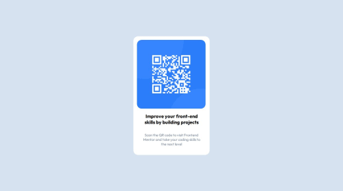
Responsive QR Code component using sass and flexbox

Solution retrospective
I am happy with the time it took me to finish this challenge. I now feel confident in using the frontend mentor platform. Although the challenge is not difficult, i struggled to make the site responsive except for the breakpoints described in the design. I would like to improve on that.
What challenges did you encounter, and how did you overcome them?I struggled to figure out the designs from figma especially the spacing and size units (padding, margin, width and font-size) but i managed to get it after i do some research about figma.
What specific areas of your project would you like help with?I would like to get help on the responsiveness of the site except for breakpoint 375px.
Please log in to post a comment
Log in with GitHubCommunity feedback
No feedback yet. Be the first to give feedback on Eyob alex's solution.
Join our Discord community
Join thousands of Frontend Mentor community members taking the challenges, sharing resources, helping each other, and chatting about all things front-end!
Join our Discord