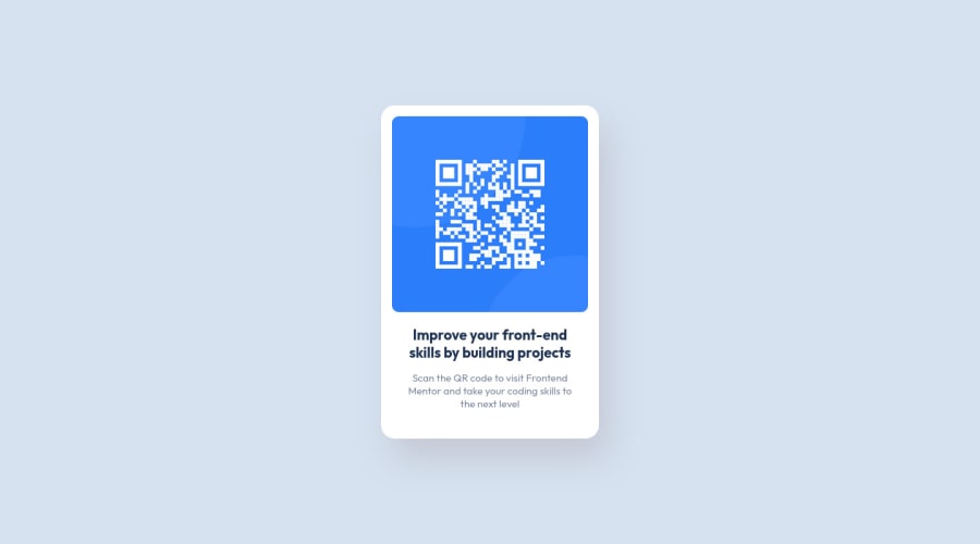
Responsive QR code component using HTML & CSS
Design comparison
Solution retrospective
Please review the code and let me know if you have any suggestions for improving it.
Community feedback
- @davinceeyPosted over 2 years ago
Hello Mohit. Congratulations on your first project! This is apt and great on the whole. Just some little tips for improvement:
-
You might want to replace the
ptag used in the first write-up, with ah1tag, so that your<main>tag, has a level-one heading. -
You might as well, want to use more of relative units such as the
emandremin applying to padding, margins, widths and font-sizes. This would help to increase the responsiveness of your layout.
You did very well. Keep up!
Hope this helps you. Happy Coding!👊
Marked as helpful1@paryanimohit1Posted over 2 years ago@davinceey Thank you for taking the time to review my code and providing feedback regarding the same.
I implemented both the points mentioned by you in my repo. Site hosted here.
I've used
emwith the text elements as I have added theirfont-sizeand for the rest, I've usedrem. Maybe you can spare a minute or two to review it and suggest if I have done something wrong, that will be very helpful. I'll be looking into this more for a better understanding.Again, Thank you for your suggestion, will keep this in mind in the future. Happy coding!
1@davinceeyPosted over 2 years ago@paryanimohit1 I'm glad to help. It's very much fine now. Happy Coding with your other projects!
1 -
- @correlucasPosted over 2 years ago
👾Hi Mohit, congratulations for your first solution!👋 Welcome to the Frontend Mentor Coding Community!
Great solution and great start! By what I saw you’re on the right track. I’ve few suggestions to you that you can consider to add to your code:
Your component is perfect, but is not responsive yet, this is due the
fixed widthyou've applied to the container.Look both
widthandmax-widththe main difference between these properties is that the first(width) is fixed and the second(max-width) isflexible, for example, a component withwidth: 320pxwill not grow or shrink because the size will be ever the same, but a container withmax-width: 320pxormin-width: 320pxcan grow or contract depending of the property you've set for the container. So if you want a responsive block element, never usewidthchoose ormin-widthormax-width.Note that there's no need to use
heighthere, because since you set aheightfor an element, this means that this element will grow until a certain point and after that the inner content (as texts or images) will start to pop out the element due its fixed height, so isn't necessary to set theheightthe container height comes from the elements, its paddings and height.✌️ I hope this helps you and happy coding!
Marked as helpful1@paryanimohit1Posted over 2 years ago@correlucas Thank you for taking the time to review my code and providing feedback regarding the same.
I've used
height: 100vhbecause the body should take the full height. Although, I've changed it tomin-heightnow in my repo. Also, I replacewidthwithmax-widthfor the image but it didn't seem to make a difference when I tried lowering the width of the screen. Hosted here.Maybe if you can spare a minute or two to check if I am doing something wrong, that would be really helpful. I'll look into it a bit more to get a better understanding of what's exactly happening.
Again, Thank you for your suggestion, will keep this in mind for future, and Happy coding!
1@correlucasPosted over 2 years ago@paryanimohit1 I think you did all fine Mohit, only one more thing to change is the
<span>with<p>thats a better tag for that paragraph. The rest is perfect. Congrats!Marked as helpful1@paryanimohit1Posted over 2 years ago@correlucas Makes sense, I will do that change. Thank you for pointing this out.
1
Please log in to post a comment
Log in with GitHubJoin our Discord community
Join thousands of Frontend Mentor community members taking the challenges, sharing resources, helping each other, and chatting about all things front-end!
Join our Discord
