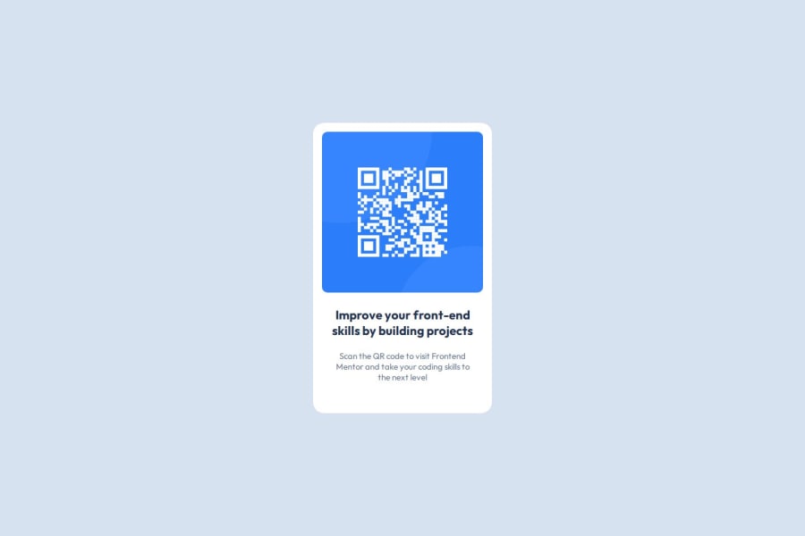
Design comparison
Solution retrospective
I'm really happy about the overall outcome and especially how i managed to design the HTML skeleton perfectly, which in return helped me to organize my CSS and finish the project similar to the challenge.
Next time i would try to write my HTML more faster to save time.
What challenges did you encounter, and how did you overcome them?Initially i had trouble designing the HTML skeleton and then i went through the preview images and figma file and managed to finish my skeleton successfully, The next challenge was writing good CSS for the elements and classes i created. Positioning the elements was quite confusing because i forgot how to center my main container. I then used flex display to achieve this positioning.
What specific areas of your project would you like help with?I would love to know more resources which will help me improve my CSS skills and write good CSS. I always have trouble assigning the width, height and positioning my components where i want them
Community feedback
Please log in to post a comment
Log in with GitHubJoin our Discord community
Join thousands of Frontend Mentor community members taking the challenges, sharing resources, helping each other, and chatting about all things front-end!
Join our Discord
