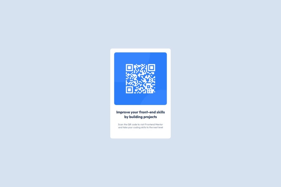
Design comparison
Community feedback
- @ManorCoderPosted 5 months ago
Code Analysis:
Your code is well done and easy to understand. The HTML structure is clear and well-organized, and the use of tags is appropriate. In CSS, you've used variables in the :root for colors, which keeps the code clean and modular. Everything is well implemented.
Documentation:
Your documentation is clear, direct, and easy to understand. You explain the purpose of each part of the code well.
Suggestions for Improvement:
Semantic HTML usage: Instead of using <div class="qr">, you could use <section class="qr"> to improve accessibility and clarity of the code.
Style and variable documentation: Add explanatory comments in the :root block about what each color represents. You could also use more intuitive names for the variables, such as --grey-mid instead of --Slate-500.
Example:
:root {
/* --- General Colors --- */
--White: hsl(0, 0%, 100%);

--grey-mid: hsl(216, 15%, 48%);
}
Learn about media queries:
design is static, but you've handled space well, which helps ensure the layout doesn’t get disrupted by screen size changes. You did a really good job.
I suggest you research media queries to make it more responsive. For example, on mobile devices, you could increase the size of elements and text to improve readability, while on desktop, you could reduce some elements and adjust margins to better utilize the available space.
0
Please log in to post a comment
Log in with GitHubJoin our Discord community
Join thousands of Frontend Mentor community members taking the challenges, sharing resources, helping each other, and chatting about all things front-end!
Join our Discord
