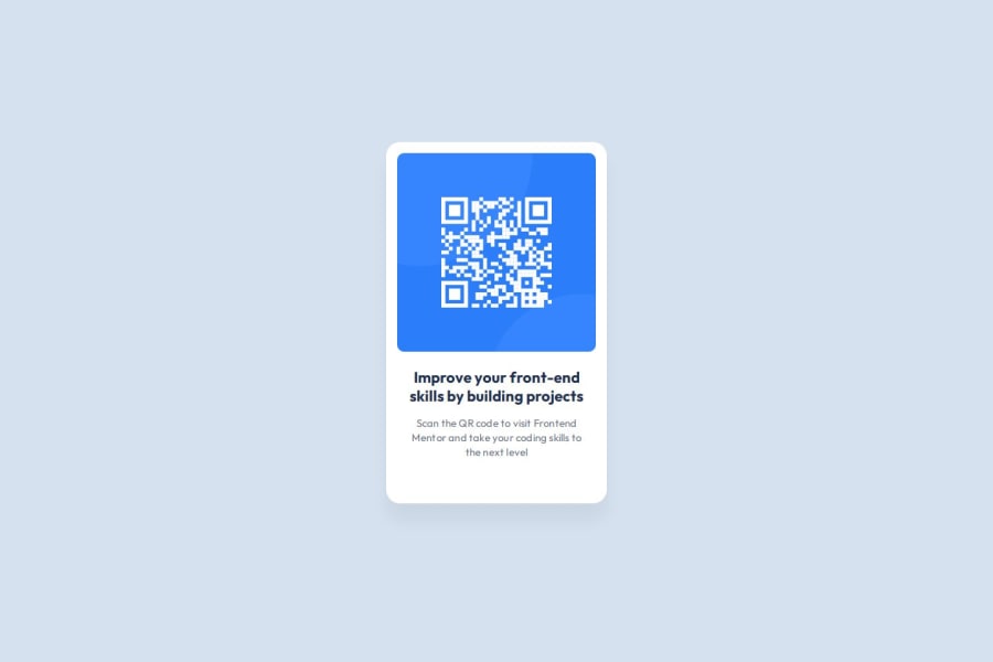


Design comparison
SolutionDesign

Solution retrospective
What are you most proud of, and what would you do differently next time?
Working on this project helped me reinforce my understanding of Flexbox and CSS custom properties. I also practiced creating a responsive design that adapts to different screen sizes.
Here's a snippet of code that I'm proud of:
.qr-card {
  display: flex;
  padding: var(--spacing-200) var(--spacing-200) var(--spacing-500) var(--spacing-200);
  flex-direction: column;
  align-items: flex-start;
  gap: var(--spacing-300);
  border-radius: 20px;
  background: var(--color-white);
  box-shadow: 0px 25px 25px 0px rgba(0, 0, 0, 0.05);
}

Join our Discord community
Join thousands of Frontend Mentor community members taking the challenges, sharing resources, helping each other, and chatting about all things front-end!
Join our Discord