Submitted 6 months ago
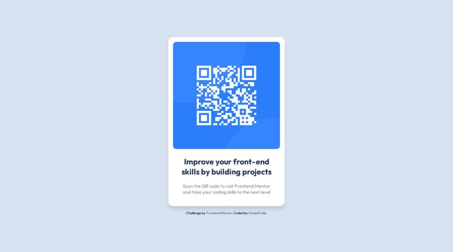
Responsive QR Code Component using Grid CSS
@DaNuTzU2110
Design comparison
SolutionDesign
Solution retrospective
What are you most proud of, and what would you do differently next time?
I am proud of finishing this challenge.
What challenges did you encounter, and how did you overcome them?I didn't encounter any problem for moment.
What specific areas of your project would you like help with?I would help with all areas because this is a simple component for beginning.
Community feedback
- @mkamburdevPosted 6 months ago
hi 🖖,
the design looks very similar to the original. It seems like a great job has been done. My only suggestion would be:
.card-text {
  color: var(--grayishBlue);
  margin: 20px 25px;
  font-weight: 400;
  max-width: 280px;
}
By adding max-width, you'll achieve an exact match with the original design, ensuring the text section's width is the same as the original design.
Hope this was helpful. Happy coding! 🤩
Marked as helpful1
Please log in to post a comment
Log in with GitHubJoin our Discord community
Join thousands of Frontend Mentor community members taking the challenges, sharing resources, helping each other, and chatting about all things front-end!
Join our Discord
