

Design comparison

Solution retrospective
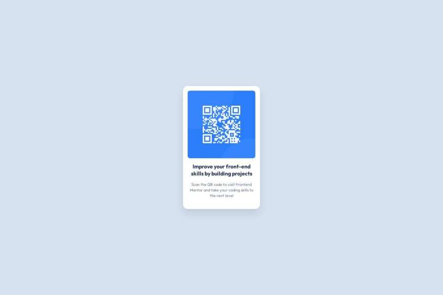
This project helped me understand how to center elements properly using Flexbox. I also learned how to use media queries for a mobile-first approach
Community feedback
- P@carltonjohnson1Posted 20 days ago
Great solution zardrick. I'm fairly new to coding and have looked at your code, and I think it looks good. I'm not 100% sure you needed the flex box on both the .container and .component-container, as I used flexbox only once in my solution, and it seems to line up in the same way. But I'm not experienced enough yet to understand why. I definitely noticed one or two things I should have added to my solution for the challenge, so thanks. 😁
Marked as helpful0@zardrickPosted 20 days ago@carltonjohnson1 Thanks for your feedback. 😊 I used Flexbox on .container to center .component-container both vertically and horizontally on the page. Then, I applied Flexbox to .component-container to make sure its content is aligned properly. While it might be possible to achieve a similar result with just one Flexbox container, using it this way gave me more control over the layout. Glad my solution could help you in some way...
0


Please log in to post a comment
Log in with GitHubJoin our Discord community
Join thousands of Frontend Mentor community members taking the challenges, sharing resources, helping each other, and chatting about all things front-end!
Join our Discord