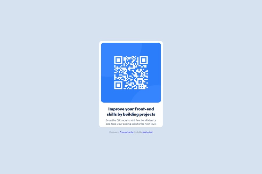
Responsive QR Code Component using Flexbox and Mobile-First Design


Design comparison

Solution retrospective
I'm most proud of the responsiveness and clean layout I achieved for the QR code component using Flexbox. I made sure the mobile-first approach was followed, and it looks great on both mobile and desktop screens. I also used CSS custom properties to manage colors, which helped keep the design consistent across the project. Next time, I’d focus more on refining the accessibility features and ensuring better contrast for readability.
What challenges did you encounter, and how did you overcome them?One of the challenges I faced was ensuring that the layout stayed flexible across different screen sizes, especially when the QR code image was scaled. I overcame this by using Flexbox, which allowed me to center the content and make sure the elements adjusted correctly when resized. Additionally, I had some issues with deploying the site on GitHub Pages, but I solved this by adjusting the folder structure and ensuring that the index.html was in the correct directory for deployment.
What specific areas of your project would you like help with?I would like feedback on my CSS structure. Specifically, how I can improve the layout for accessibility or use more efficient methods for styling. I'd also appreciate suggestions on improving the design for larger screens to make sure the elements maintain a clean look when scaling up.
Community feedback
- @RishiijainnPosted about 2 months ago
keep it up
1

Please log in to post a comment
Log in with GitHubJoin our Discord community
Join thousands of Frontend Mentor community members taking the challenges, sharing resources, helping each other, and chatting about all things front-end!
Join our Discord