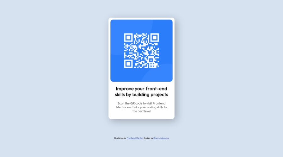
Design comparison
SolutionDesign
Solution retrospective
Let me know what kind of improvements I can make.
Community feedback
- @RioCantrePosted about 3 years ago
Hello there! Awesome work with this one. Viewing your solution, I think you should considered the following as well...
- Instead of using percentage for the width. Replace it with fix size
320px. In this way, the responsive design for mobile would stay the same.
Hope this helps and Keep up the good work!
1 - Instead of using percentage for the width. Replace it with fix size
Please log in to post a comment
Log in with GitHubJoin our Discord community
Join thousands of Frontend Mentor community members taking the challenges, sharing resources, helping each other, and chatting about all things front-end!
Join our Discord
