

Design comparison

Solution retrospective
I'm particularly proud of successfully implementing a responsive layout using Flexbox. It was satisfying to see how the design adapted seamlessly to different screen sizes. Additionally, I was able to use CSS custom properties effectively for easier color management throughout the project.
Next time, I would focus more on enhancing accessibility features, such as adding ARIA labels and improving keyboard navigation. I’d also like to explore using CSS Grid for more complex layouts and experiment with different layout techniques to gain more flexibility in design.
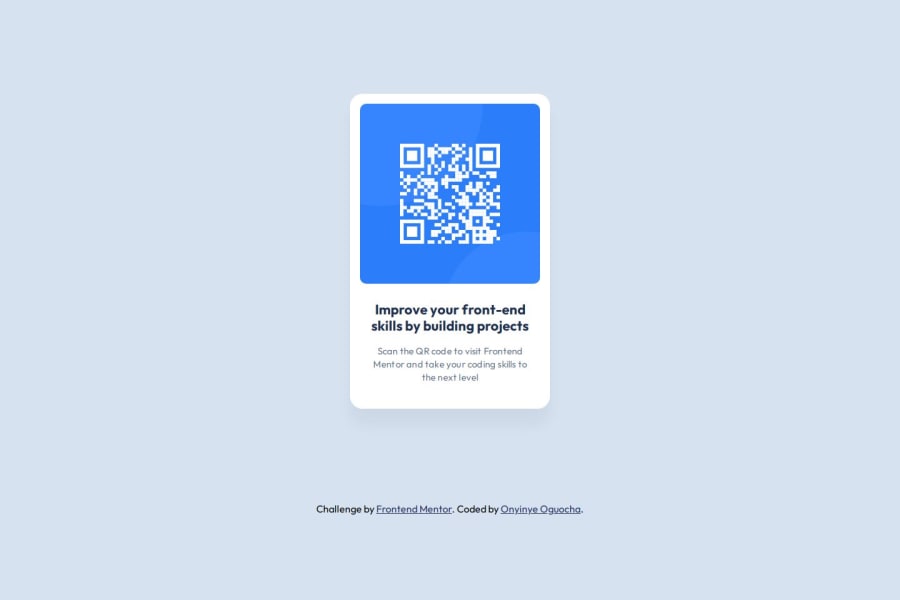
What challenges did you encounter, and how did you overcome them?One of the main challenges I faced was centering the QR code card on the page while maintaining consistent spacing on all screen sizes. Initially, I struggled with ensuring the card remained responsive without breaking the layout.
I overcame this by using Flexbox to align and justify the content centrally, which allowed the card to stay perfectly centered across different viewport sizes. Additionally, I tweaked the padding and margin settings until the spacing felt just right.
What specific areas of your project would you like help with?-Text Overflow and Wrapping: I’d like feedback on how to better handle text wrapping within the card to avoid overflow without increasing the card’s width.
-Box Shadow Effect: I used a box-shadow effect on the card but would love to know how to make it appear more subtle and natural.
-Accessibility Improvements: Any suggestions on how to make the QR code component more accessible for users relying on screen readers would be greatly appreciated.
-Mobile Responsiveness: While the layout is responsive, I'd appreciate feedback on improving the look and feel on smaller devices, especially in terms of spacing and padding.
-Figma Design System: This was my first time using Figma, and I couldn’t find the exact margin values for the card component in the design system. Any guidance on how to properly extract such details in Figma would be helpful.
-CSS Grid: I wanted to try using CSS Grid but couldn’t figure out how to incorporate it into this project. Any tips or examples of how to use it effectively in this layout would be appreciated.
Community feedback
Please log in to post a comment
Log in with GitHub
Join our Discord community
Join thousands of Frontend Mentor community members taking the challenges, sharing resources, helping each other, and chatting about all things front-end!
Join our Discord