Submitted 10 months ago
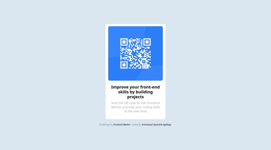
responsive QR code component using flex box
@Emmanuel-Q
Design comparison
SolutionDesign
Solution retrospective
What are you most proud of, and what would you do differently next time?
I am proud of the fact that i am able to use flex box to position the component in the middle of the page.
What challenges did you encounter, and how did you overcome them?The challenging aspect was how to get the component to look the same as the design since there design doesn't give the details of the dimensions used.
What specific areas of your project would you like help with?I will need help with the proper alignment of items
Community feedback
Please log in to post a comment
Log in with GitHubJoin our Discord community
Join thousands of Frontend Mentor community members taking the challenges, sharing resources, helping each other, and chatting about all things front-end!
Join our Discord
