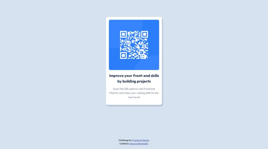
Responsive qr code component using cube css
Design comparison
Community feedback
- @burrijwPosted almost 2 years ago
Nice 👍🏻
A couple things:
- You need one (and usually only one)
<main>on each page of a website. - Overall you could probably simplify your HTML a bit. Nothing major, but there's no need for the
<header>inside the card, for example. Keep it simple. - Check your padding and border-radius values. I think you could get closer to the design with a bit of tweaking. No need to be pixel-perfect, but you could be closer, IMO.
Great job -- keep it up!
Marked as helpful1@Hanane05Posted almost 2 years agoThank you for your feedback, I'll consider that. I'll be more than happy to receive your feedbacks, thanks again :) @burrijw
0 - You need one (and usually only one)
Please log in to post a comment
Log in with GitHubJoin our Discord community
Join thousands of Frontend Mentor community members taking the challenges, sharing resources, helping each other, and chatting about all things front-end!
Join our Discord
