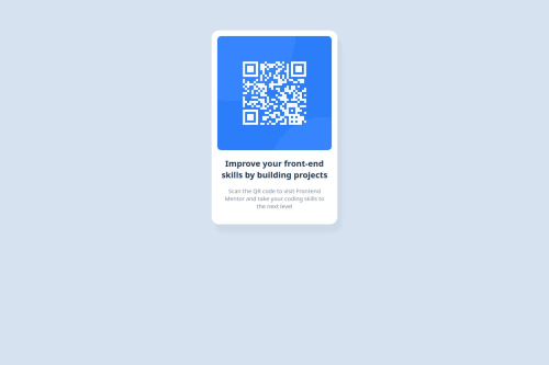
Submitted over 1 year agoA solution to the QR code component challenge
Responsive QR code component using CSS
@ktmagno

Solution retrospective
What are you most proud of, and what would you do differently next time?
I'm happy it didn't take my whole day to finish the challenge. Think I should do a JS challenge next time.
What challenges did you encounter, and how did you overcome them?I want to find a better solution for placing the elements in the center without the footer overlapping with the content when zoomed in. I used the same code in my previous challenge, setting margin-top and margin-bottom to center the content vertically.
What specific areas of your project would you like help with?Right way of centering a div element. Thanks!
Code
Loading...
Please log in to post a comment
Log in with GitHubCommunity feedback
No feedback yet. Be the first to give feedback on ren's solution.
Join our Discord community
Join thousands of Frontend Mentor community members taking the challenges, sharing resources, helping each other, and chatting about all things front-end!
Join our Discord