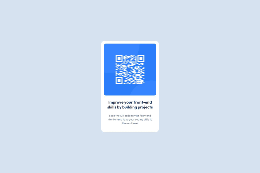
Responsive QR Code Component using CSS grid and flexbox
Design comparison
Solution retrospective
I'm most proud of the use of CSS Grid and flebox to create the centering and card component for the project. I would change my knowledge of Figma in order to understand better the design system and how to relates to the project.
What challenges did you encounter, and how did you overcome them?Overall, I did not encounter very many challenges for this project, I would however like to overcome any areas in my code that could be made more readable or improve its performance.
What specific areas of your project would you like help with?As I mentioned in question number two I would appreciate help in reviewing my code to ensure it meets current standards for clean and readable code. I am new in web development and want to learn to create good code.
Community feedback
- @BrianMunizSilveiraPosted 4 months ago
Solution Retrospective: QR Code Component Challenge
What Are You Most Proud Of, and What Would You Do Differently Next Time?
Great job using CSS Grid and Flexbox to structure and center the card component! These are powerful tools for layout creation. It's also impressive to see your interest in Figma and its design systems. Understanding Figma can indeed enhance your ability to interpret and implement designs accurately.
For next time, consider exploring responsive design techniques, even if this challenge does not explicitly require them. Learning how to adapt layouts for different screen sizes will elevate your skills as a front-end developer.
What Challenges Did You Encounter, and How Did You Overcome Them?
You mentioned not facing many challenges, which is excellent! However, striving for code readability and performance optimization is a fantastic goal. By focusing on writing clean, well-organized CSS and semantic HTML, you'll align your code with industry standards and improve its maintainability.
Suggestions for Improvement
Here are some suggestions to refine your solution and further enhance your skills:
1. Make the Component Fully Responsive
Although the layout is fixed for this challenge, it's a good practice to use responsive techniques. For example, adding media queries will ensure the card adjusts gracefully on smaller or larger screens:
@media (max-width: 480px) {
    #card {
        width: 90%; /* Shrinks the card on smaller devices */
        padding: 12px; /* Adjusts padding */
    }

    .title {
        font-size: 20px; /* Reduces title size */
    }

    .description {
        font-size: 14px; /* Reduces description size */
    }
}
2. Semantic HTML
Your structure is clean, but we can enhance semantic HTML by using appropriate tags:
-
Instead of <div class="content">, you could use a <section> to indicate a meaningful division of the content.
-
Ensure the <img> tag includes an accessible alt text that describes the QR Code, such as:
<img src="./images/image-qr-code.png" alt="QR Code linking to Frontend Mentor website">
3. Improve Typography Readability
You’ve done a good job with the font sizes and line-heights. For better readability:
- Use a slightly larger line-height for the title to make the text feel more open:
.title { line-height: 1.5; }- Consider using a text-shadow for the title to make it stand out subtly:
.title {
    text-shadow: 0 1px 3px rgba(0, 0, 0, 0.1);
}
4. Add Subtle Interactivity
- A small hover effect can add a polished, interactive feel to the component. For example:
#card:hover {
    box-shadow: 0 8px 24px rgba(0, 0, 0, 0.2);
    transition: box-shadow 0.3s ease-in-out;
}
5. Code Comments for Maintainability
- Adding comments in your CSS can help clarify your intentions for future reference or collaboration. For example:
/* Container for the QR code and content */
#card {
    display: flex;
    flex-direction: column;
    width: 320px;
    background: var(--white);
    /* Additional styles omitted for brevity */
}
6. Consider Using Utility Classes
- Instead of repeating styles in different contexts, you could explore utility classes to streamline your code. For instance:
.text-center { text-align: center; } .mt-24 { margin-top: 24px; }- This approach can simplify your HTML:
<h2 class="title text-center mt-24">Improve your front-end skills by building projects</h2>
What Specific Areas of Your Project Would You Like Help With?
It's wonderful to see that you’re eager to learn about writing clean and readable code. Here are some general tips:
-
Follow a consistent naming convention for classes. For example, use either camelCase, snake_case, or kebab-case consistently throughout.
-
Organize your CSS logically by grouping related styles and using comments to separate sections.
-
Use CSS variables effectively to avoid hardcoding values like padding or font sizes in multiple places. For example:
:root {
    --padding-small: 16px;
    --font-size-title: 22px;
}
Summary
Your solution is already strong and shows great use of CSS Grid and Flexbox for layout and centering. By focusing on responsiveness, semantic HTML, and adding small touches like interactivity, you can make your component even more polished and professional.
Keep up the excellent work, and don’t hesitate to ask for help or feedback from the community as you continue learning! 😊
Brian.
0 -
Please log in to post a comment
Log in with GitHubJoin our Discord community
Join thousands of Frontend Mentor community members taking the challenges, sharing resources, helping each other, and chatting about all things front-end!
Join our Discord
