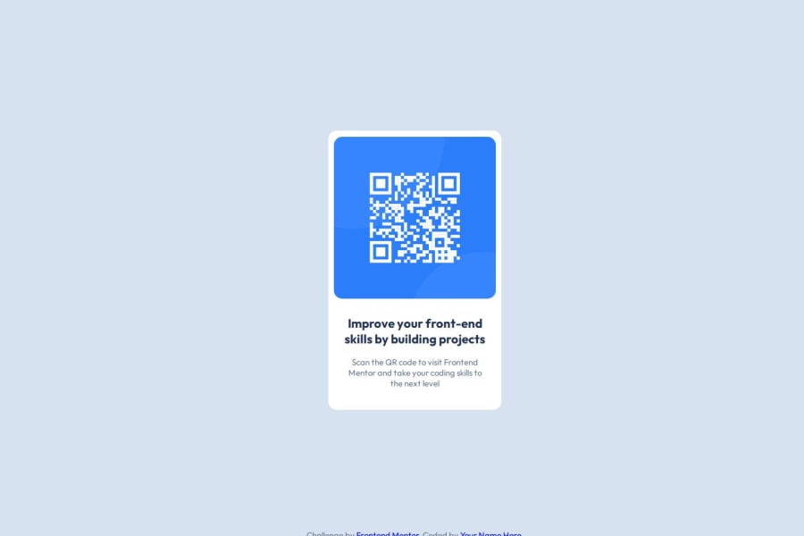
Design comparison
Solution retrospective
- Understanding the box model and how to leverage it to build the solution, took some time
I have tried my best to create this website. It would be better if we can improve up on it, in terms of simplifying the CSS or leveraging other tools to get a better output.
So, It would be better to know good tips about how to make the CSS better to get the output as intended, would be beneficial for next projects.
Thanks for this beautiful project
Community feedback
- @AramHagenPosted 6 months ago
The height of the card is not match with design. You didn't need to use for container. font-size of title is 22px not 18px.
Marked as helpful0@wicked-codesPosted 6 months ago@AramHagen
Thanks for taking time to review the code.
I have made the changes:
- font-size of title to 22px
- height of the card to 500px
As for using container, I wanted to make it as a component, so I can re-use it.
Please provide a better way to handle the scenario.
Again, Thank you so much!
0
Please log in to post a comment
Log in with GitHubJoin our Discord community
Join thousands of Frontend Mentor community members taking the challenges, sharing resources, helping each other, and chatting about all things front-end!
Join our Discord
