Design comparison
Solution retrospective
I've some questions for sure. First, how to learn or practice centering items to the middle in CSS, so that I won't have to look up it again. I have to practice and memorize all of that basic stuff. I've done this with the help of online videos.
Community feedback
- @elaineleungPosted about 2 years ago
Hey Doğukan, I saw the comments here and just wanted to add my 2 cents as well. I found this little tool recently on flexbox (https://flexbox-guide.vercel.app/) that was put together by a developer who was explaining to some interns what flexbox is. I think it's a great tool for anyone really, but especially those who are learning and haven't fully grasped its concept yet. The best thing is, it even has a CSS snippet for you to copy based on the layout you want, so anyway, even if you just play around with it to learn how flexbox works and what properties there are, I think it could still be a great help.
Here's his post if you're interested: https://dev.to/souravdey777/flexbox-guide-flexbox-layout-made-simple-with-an-interactive-tool-5g77
Also, keep going, you're doing great 😊
Marked as helpful1@dogukan0055Posted about 2 years ago@elaineleung Hi there Elaine! Thanks for your comment, appreciated it! I'll try this so that I can memorize it and remember it like my name? :D And thank you for your motivation! I'll try to do my best, and with time I hope that I can help someone from this community, just like you all guys did to me :) Have a great one!
1@elaineleungPosted about 2 years ago@dogukan0055 Yes, I'm sure you'll get there 😊 What's great about this platform is, you can just start giving feedback and teaching others what you just learned, no need to reach a certain level. And yes, hope you'll become so good at flexbox that you might start remembering it like your name, but thankfully your name is a lot cooler than "flexbox" 😆
Marked as helpful1@dogukan0055Posted about 2 years ago@elaineleung Ahahaha thanks, Elaine :) Yours is also kind of a unique one, right? Trying to practice as much as I can ^^
1 - @PhoenixDev22Posted about 2 years ago
Hi Doğukan,
Congratulation on completing this challenge. Great job on this one. I have some suggestions regarding your solution if you don’t mind:
- You should use
<main>
to wrap the card and<footer>
for the attribution . HTML5 landmark elements are used to improve navigation experience on your site for users of assistive technology.
- Page should contain
<h1>
. In this challenge , as it’s supposed to be a part of a whole page, you may use<h1>
visually hidden with class=”sr-only”. You can find it here
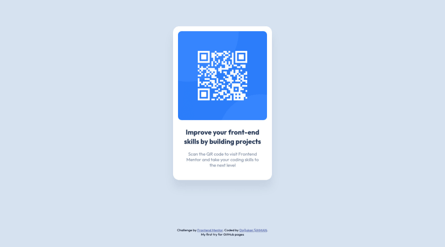
- In my opinion, the alternate is needed on this image. It should indicate where the Qr code navigate the user : like
QR code to frontend mentor
.
- Adding
rel="noopener"
orrel="noreferrer"
totarget="_blank"
links. When you link to a page on another site usingtarget=”_blank”
attribute , you can expose your site to performance and security issues.
- You have used
<br>
, using<br>
is not only bad practice, it is problematic for people who navigate with the aid of screen reading technology. Screen readers may announce the presence of the element. This can be a confusing and frustrating experience for the person using the screen reader. You can read more in MDN.
- It’s not recommended to use
<br>
to increase the gap between lines of text Or make empty space between elements, usepadding / margin
styling via CSS. And about using <br> in the<p>
to make the paragraph break in new line, You may usemax-width
to<p>
and remove those<br>
Hopefully this feedback helps.
Marked as helpful1@dogukan0055Posted about 2 years ago@PhoenixDev22 Thanks for your suggestions m8! You're right, gotta be more careful with those tags. I thought I used the <footer> tag but seems like I didn't :D And I didn't put the h1 tag 'cause h1 looks very big to me. I know that I can style it using CSS but, don't know why I didn't do that :D Also I thought that I used alternate for the image, seems like I didn't do it :D And you're right about <br> usage. I gotta be more careful with it. I'll try to implement it to my codes. Thanks again :)
0 - You should use
- @correlucasPosted about 2 years ago
👾Hello Doğukan, congratulations for your new solution!
Answering your question: to make the center vertical alignment first of all put
min-height: 100vh
to thebody
to make the body display 100% of the viewport height (this makes the container align to the height size thats now 100% of the screen height) size anddisplay: flex
eflex-direction: column
to align the child element (the container) vertically using the body as reference.🐸 Use this mini game to learn
FLEXBOX
and all its properties by ALIGNING EVERYTHING the frog and become aFLEXBOX MASTER
here's the link: https://flexboxfroggy.com/✌️ I hope this helps you and happy coding!
Marked as helpful0@dogukan0055Posted about 2 years ago@correlucas Hey there Lucas! Thanks for your feedback :) Appreciate it. I've played this game before I suppose, my only problem is that, because I'm also full-time working, my practice has time gaps, and therefore can't do my best on this learning journey? :D
Those are some good advice to write it down. Thx again ^^
1@DavidMorgadePosted about 2 years ago@dogukan0055 Hey man I really feel you because I was almost in the same position as you, I usually had to read some documentation and watched videos in between rest time when I was full at a full working journey, I had to manage my time if I also wanted to keep my coding progress.
1@dogukan0055Posted about 2 years ago@DavidMorgade that's right man yeah, you have to be careful with your timings, otherwise, you'll get nothing in the end. Time management is essential.
1
Please log in to post a comment
Log in with GitHubJoin our Discord community
Join thousands of Frontend Mentor community members taking the challenges, sharing resources, helping each other, and chatting about all things front-end!
Join our Discord