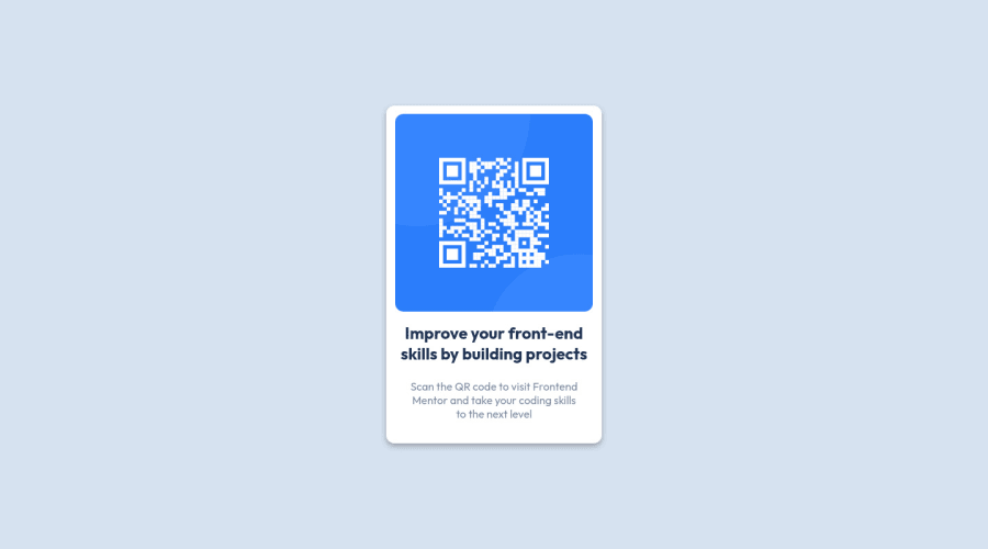
Design comparison
Solution retrospective
Any kind of feedback would be appreciated.
Community feedback
- @Sdann26Posted almost 3 years ago
Hi iqra0001!
Regarding the design you have done well but try to remove the comments from your HTML as it is creating conflicts in the frontend mentor report.
Also change the <div class="main-container"> to <main class="main-container"> as it is semantically more accurate to use it in this context and in the end it has the functionality of encompassing all the main content of your project, being necessary to always put only one inside the body.
Don't forget to generate a new report after correcting so that the challenge comes out without any error.
If you can make the card slightly larger so that the word to goes on the second line.
With those details it would be perfect.
Hehehe good coding!
Marked as helpful1@iqra0001Posted almost 3 years ago@Sdann26 Thank you so much for your valuable feedback. I have updated the code according to your instructions and regenerated the report too. Thankfully there are no HTML or accessibility issues now. Do let me know if any other kind of improvements are needed in the design or code.
1 - @Bayoumi-devPosted almost 3 years ago
Hey! Congratulations on completing this challenge... You have
accessibility issuesthat need to fix.Document should have one main landmark, Contain the component with<main>.
<main>
   <div class="main-container">
      //...
   </div>
</main>
Hope this is helpful to you... Keep coding👍
Marked as helpful1@iqra0001Posted almost 3 years agoJust fixed it. Thank you so much feedback! @Bayoumi-dev
0
Please log in to post a comment
Log in with GitHubJoin our Discord community
Join thousands of Frontend Mentor community members taking the challenges, sharing resources, helping each other, and chatting about all things front-end!
Join our Discord
