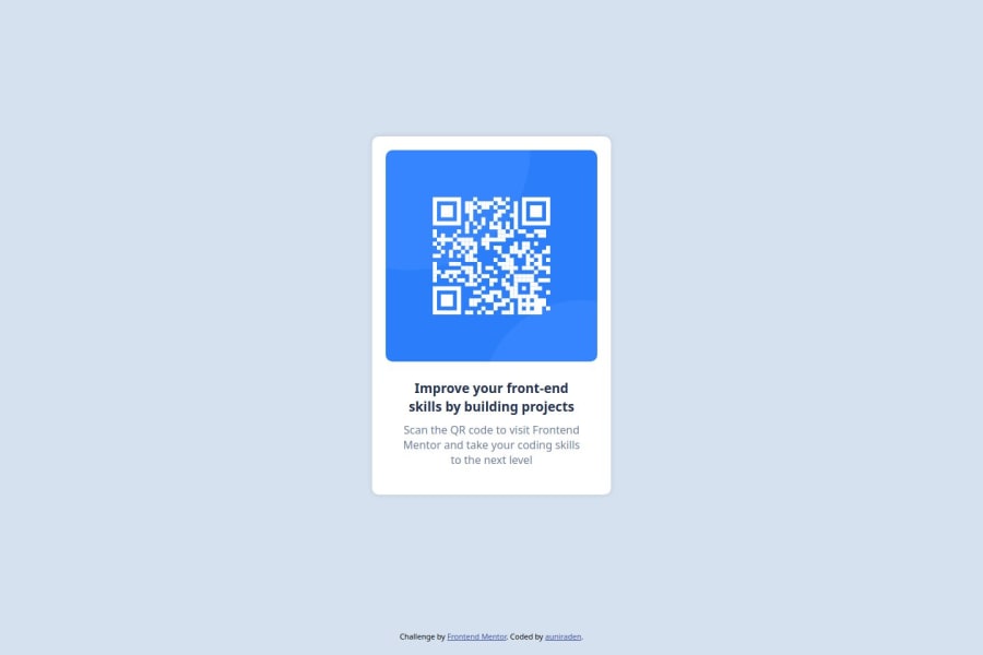
Design comparison
Solution retrospective
I’m most proud of successfully translating the design into clean, responsive code while maintaining the layout’s accuracy and simplicity. If I were to approach this project again, I would focus on optimizing my workflow by planning out the structure and styles more thoroughly before coding to reduce the time spent on adjustments. Additionally, I would explore using CSS Grid for more complex layouts to expand my skills further.
What challenges did you encounter, and how did you overcome them?One challenge I encountered was ensuring the QR code component was perfectly centered on the page across different screen sizes. To overcome this, I utilized flexbox for its flexibility and ease in centering elements both vertically and horizontally. I also referred to MDN Web Docs for guidance on flexbox properties and tested the layout across various devices to ensure responsiveness.
Community feedback
- P@thibault-devergePosted 7 months ago
Overall Feedback: First of all, excellent work! You've done a great job and the design is really close to the original. The layout works well across devices, especially on phone screens, which is a big win for responsiveness!
Visual Feedback:
- Border Radius: The border radius on the container is slightly off compared to the original design. It’s a small detail, but achieving pixel-perfect precision is a valuable skill. Paying attention to these details will bring your design even closer to the original.
- Typography: The heading could be a bit bolder to match the design more closely, and the font size of the text could be slightly smaller. As part of the learning path, the igma file is available for free for the first two projects—it's a great tool to refine your pixel-perfect integration skills.
- Font Family: I noticed that the font family isn't displaying correctly because of a small typo. In the CSS, you have
"Outift"instead of"Outfit". Fixing this should resolve the issue.
Code Feedback:
- Naming Conventions: The naming structure in your code is fine, especially for a small project like this. However, as projects grow larger, it might be helpful to adopt a more consistent naming convention like BEM (Block, Element, Modifier). It’s a good habit that will make your code more scalable and easier to manage.
- Semantic HTML: Great job using semantic elements like
<main>,<section>, and<article>instead of relying solely on<div>! This improves both accessibility and SEO. Keep this up! - File Organization: It's a best practice to store your CSS files in a
stylesdirectory instead of placing them inassets. This will keep your project structure clean and organized. Adding a CSS reset file would also be beneficial to remove browser inconsistencies and ensure your design renders more consistently across different browsers. - Relative Units: It’s great to see you using
remandemfor font sizes, which is excellent for accessibility and scalability. Try applying the same approach to padding and margin values as well. Pixels should generally be reserved for small, unchanging elements likeborder-radius.
Conclusion: Overall, this is a fantastic effort, and you’re definitely on the right track! There are a few areas to refine, but that's really good already! Keep pushing forward, and I’m excited to see how your future projects turn out. Best of luck, and happy coding! :)
1 - P@StroudyPosted 7 months ago
Exceptional work! You’re showing great skill here. I’ve got a couple of minor suggestions that could make this stand out even more…
- Having a clear and descriptive
alttext for images is important because it helps people who use screen readers understand the content, making your site more accessible. It also improves SEO, as search engines usealttext to understand the image's context, helping your site rank better, Check this out Write helpful Alt Text to describe images,
<img src="images/image-qr-code.png" alt="QR code" />❌ <img src="images/image-qr-code.png" alt="A image of QR code" />✅- You have a
main article sectionall doing the same job, You can just keep the main,
<main> <section class="container"> <article class="QRCard"> </article> </section> </main>-
Using a full modern CSS reset is beneficial because it removes default browser styling, creating a consistent starting point for your design across all browsers. It helps avoid unexpected layout issues and makes your styles more predictable, ensuring a uniform appearance on different devices and platforms, check out this site for a Full modern reset
-
Using
remoremunits in@mediaqueries is better thanpxbecause they are relative units that adapt to user settings, like their preferred font size. This makes your design more responsive and accessible, ensuring it looks good on different devices and respects user preferences.
@media (max-width: 768px)- For future project, You could download and host your own fonts using
@font-faceimproves website performance by reducing external requests, provides more control over font usage, ensures consistency across browsers, enhances offline availability, and avoids potential issues if third-party font services become unavailable. Place to get .woff2 fonts
I hope you’re finding this guidance useful! Keep refining your skills and tackling new challenges with confidence. You’re making great progress—stay motivated and keep coding with enthusiasm! 💻
0 - Having a clear and descriptive
Please log in to post a comment
Log in with GitHubJoin our Discord community
Join thousands of Frontend Mentor community members taking the challenges, sharing resources, helping each other, and chatting about all things front-end!
Join our Discord
